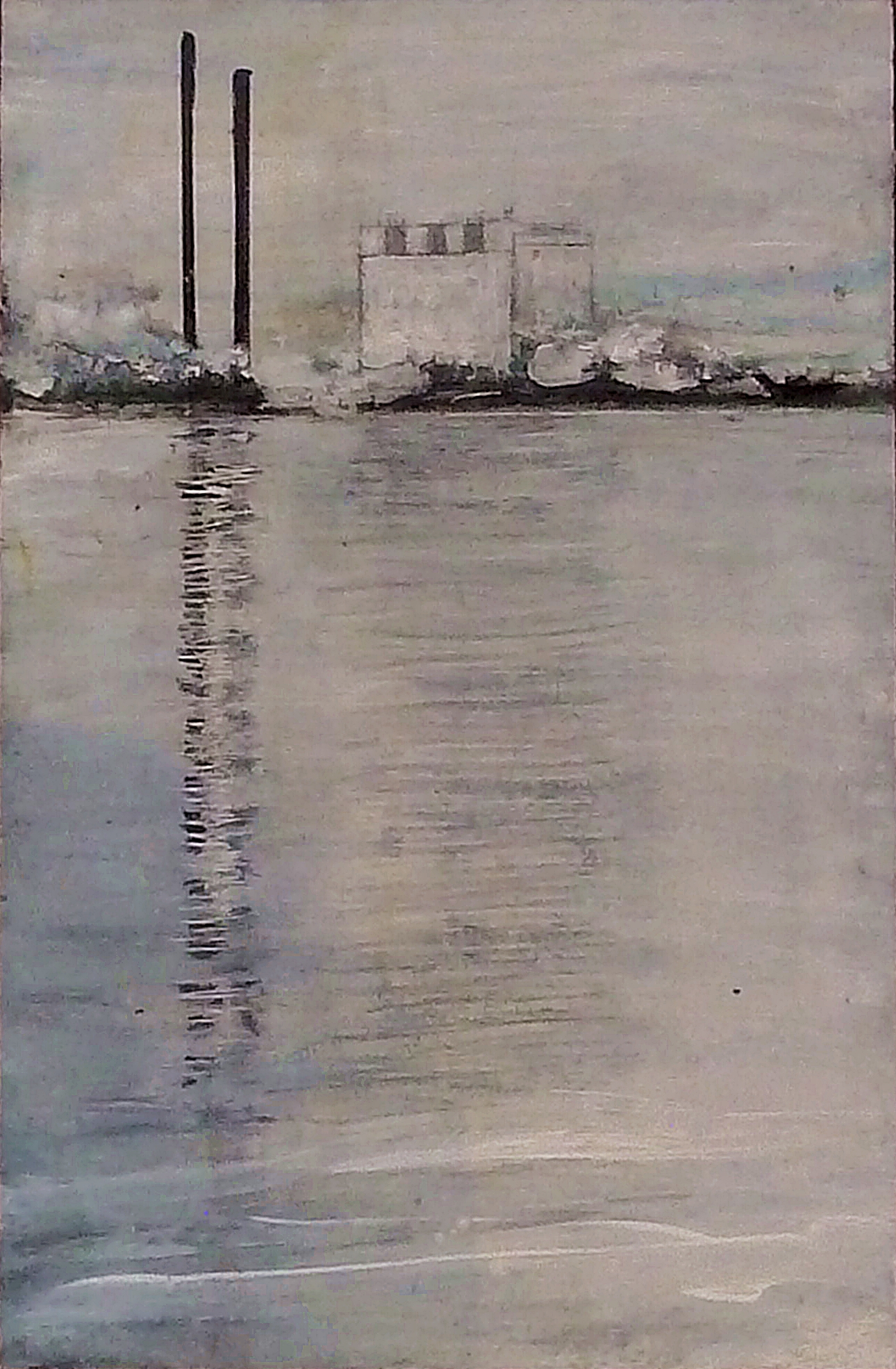
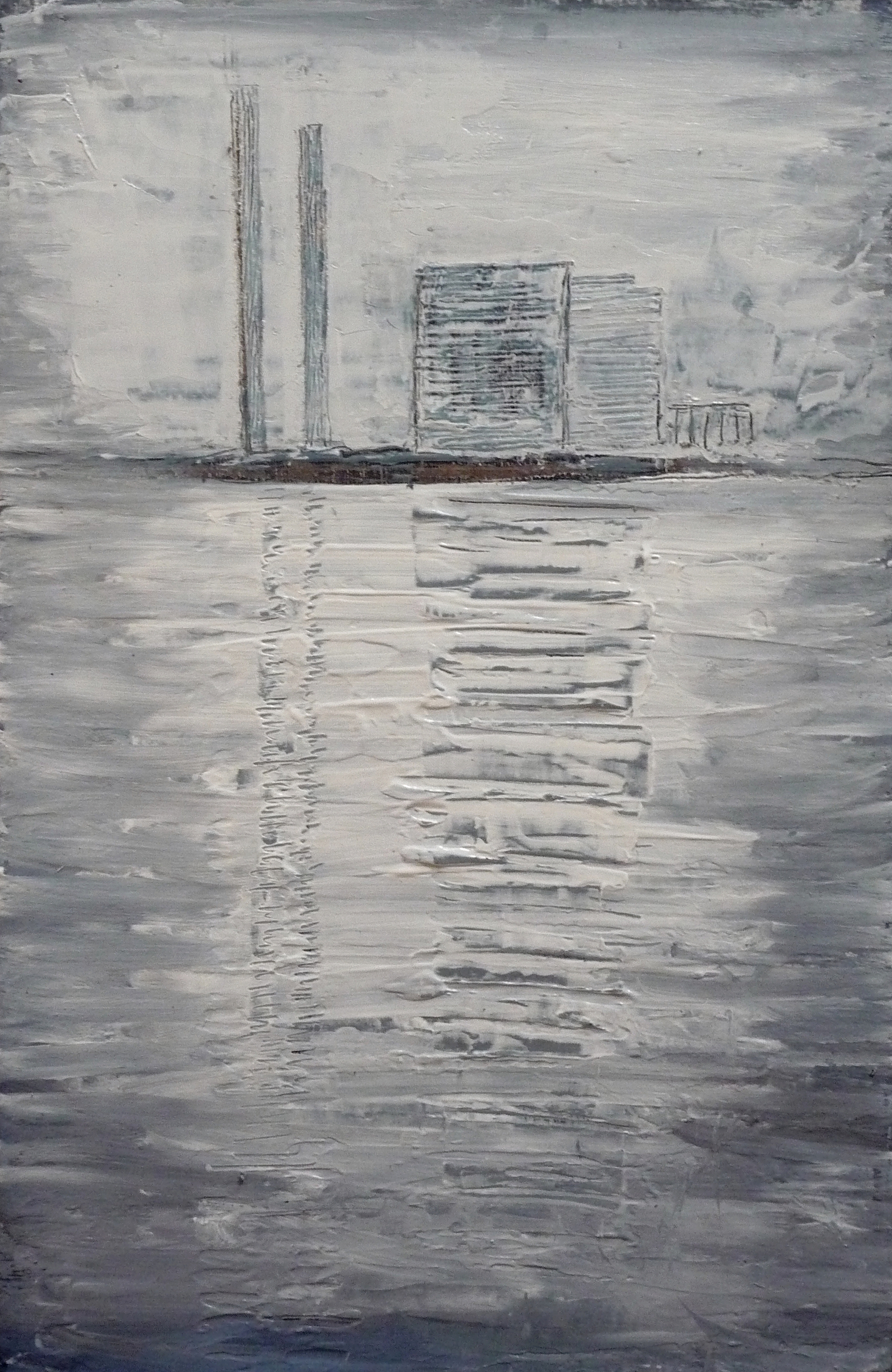
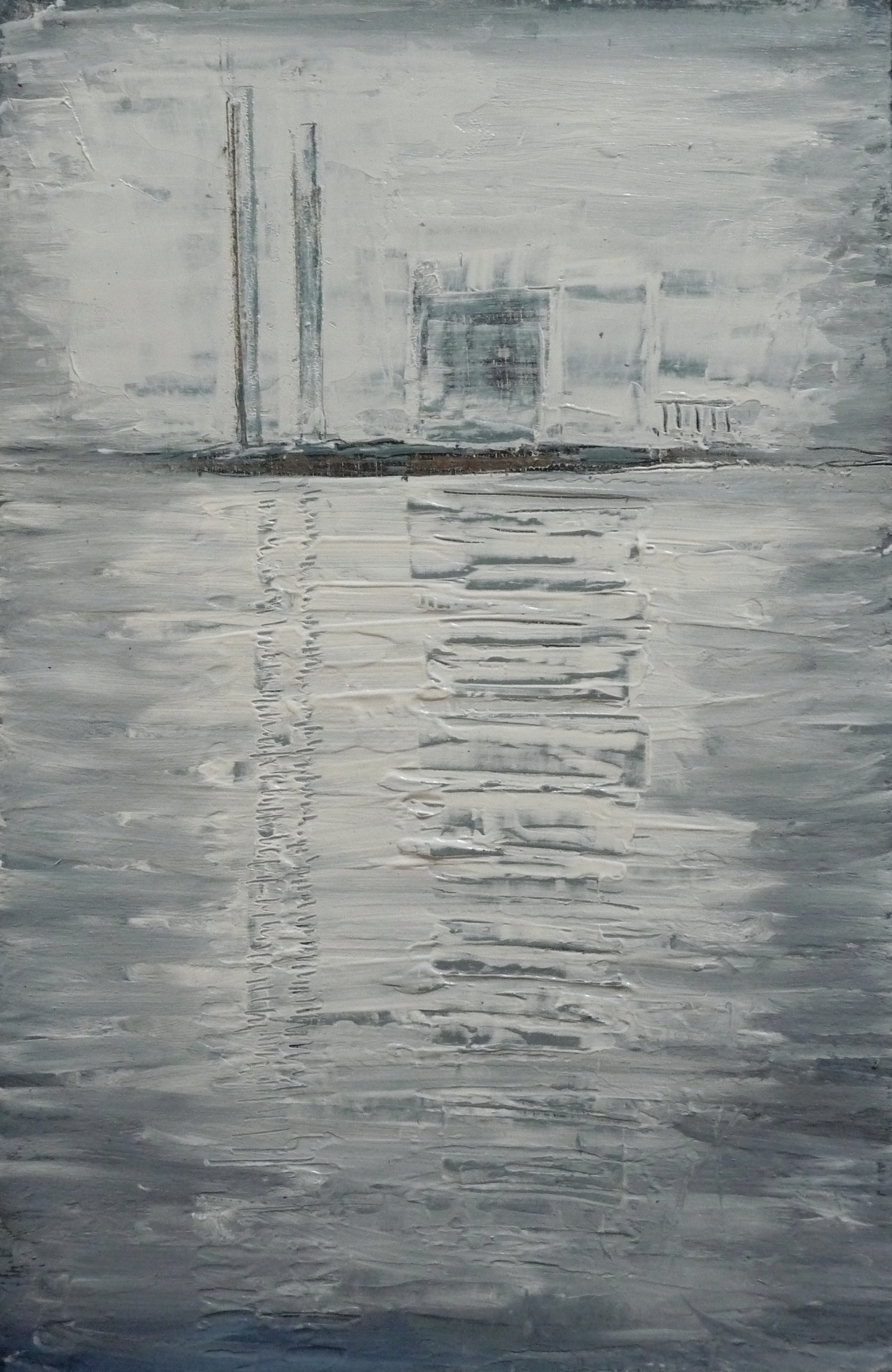
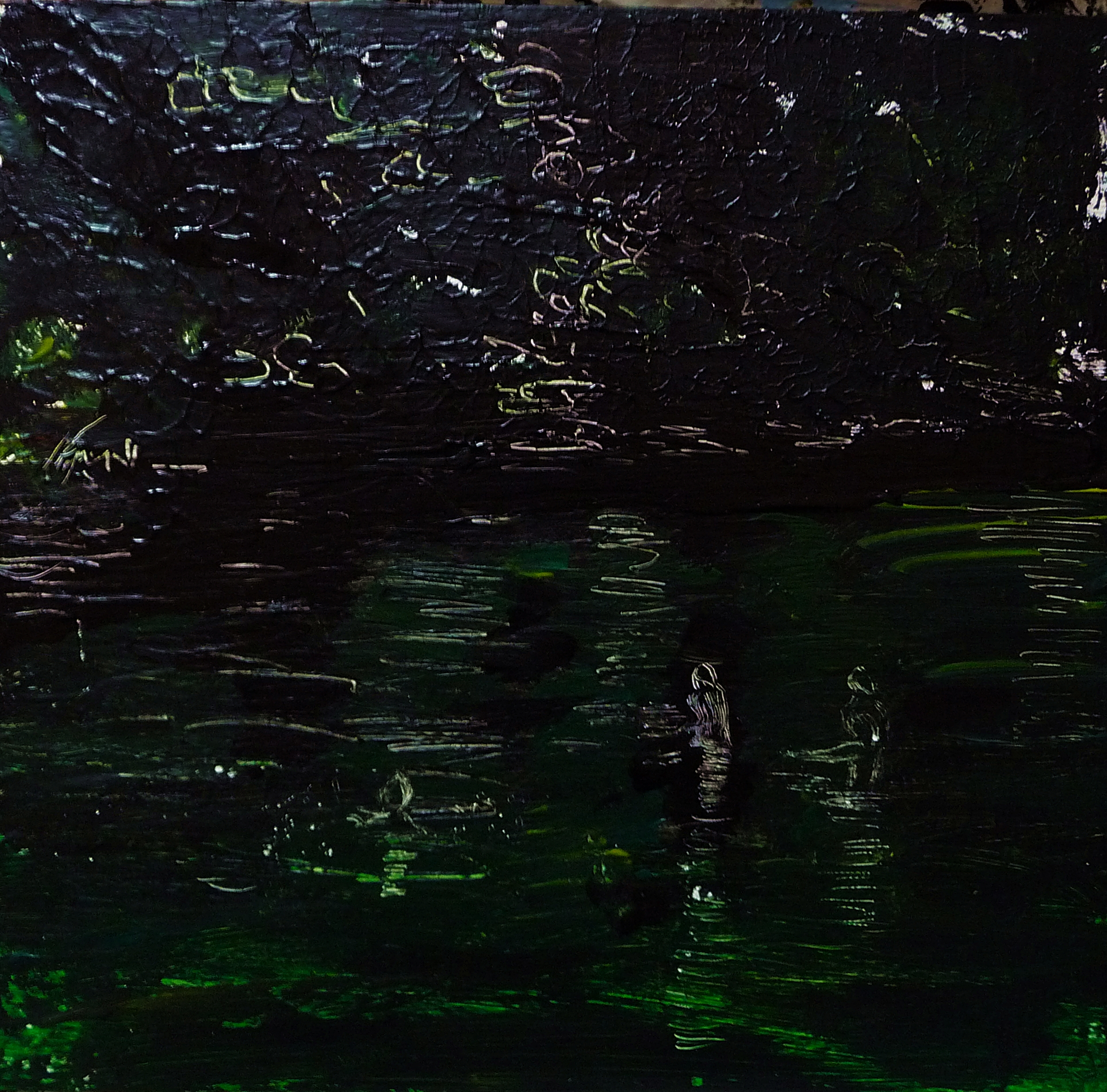
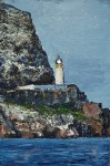
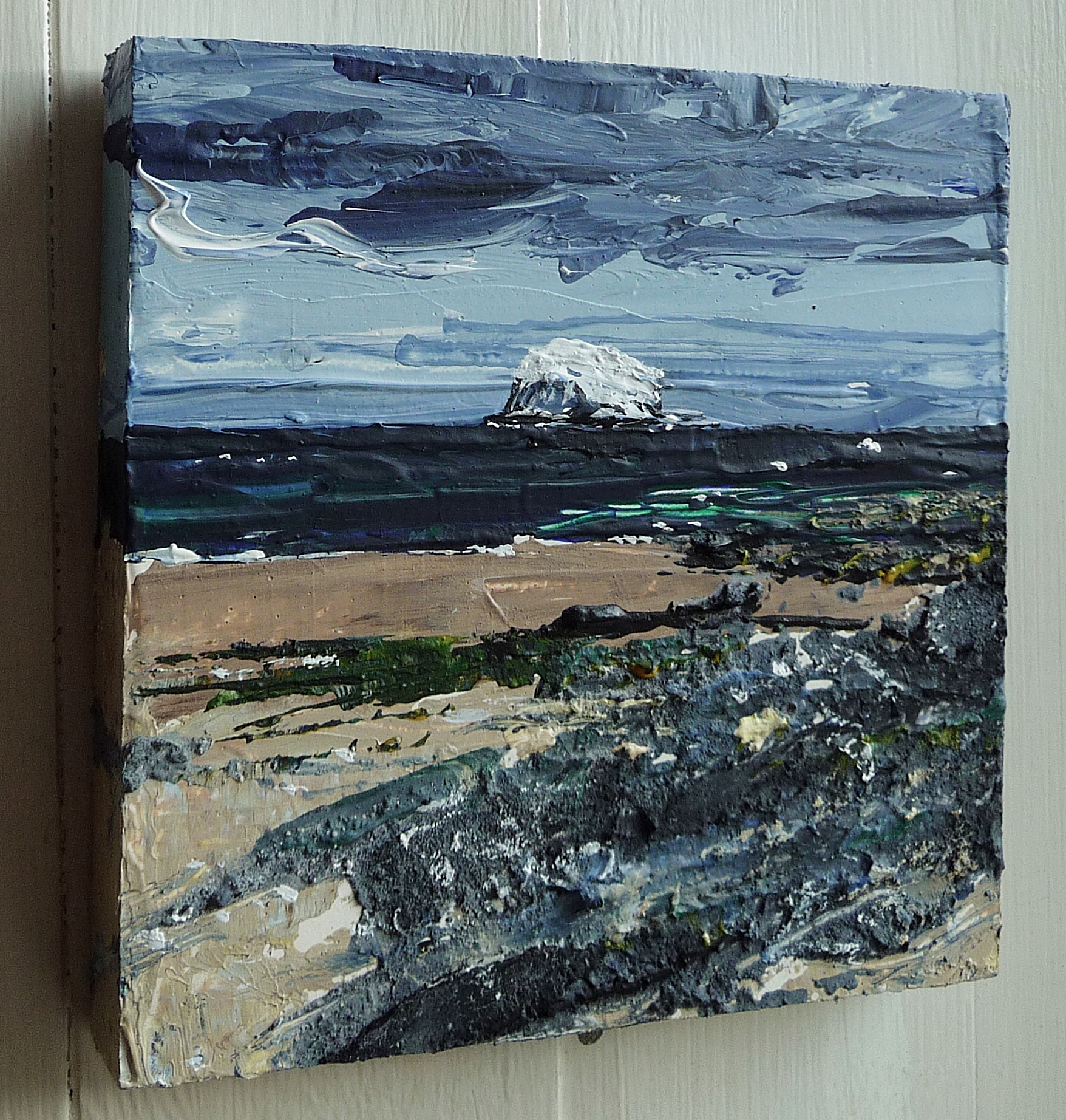
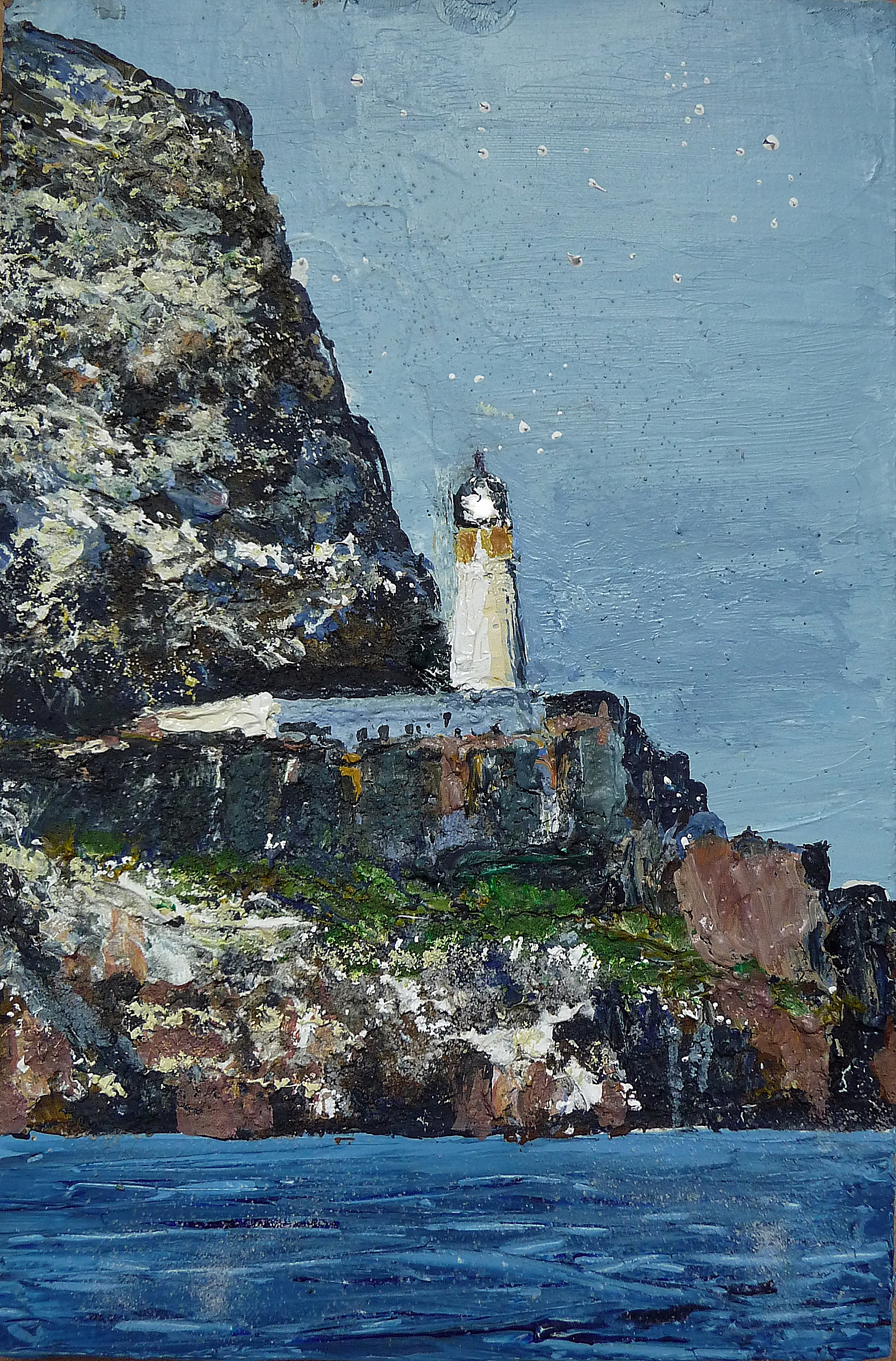
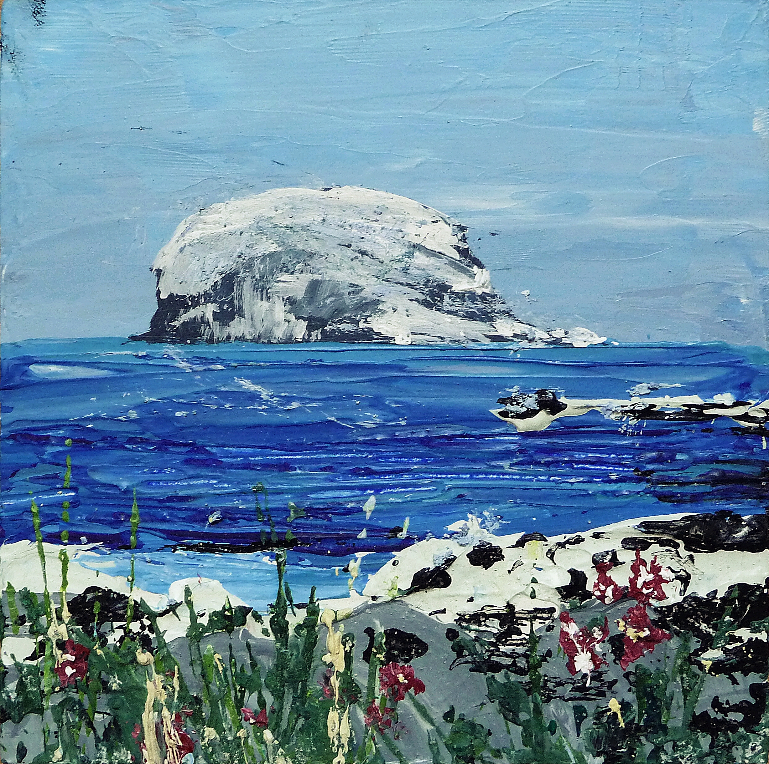
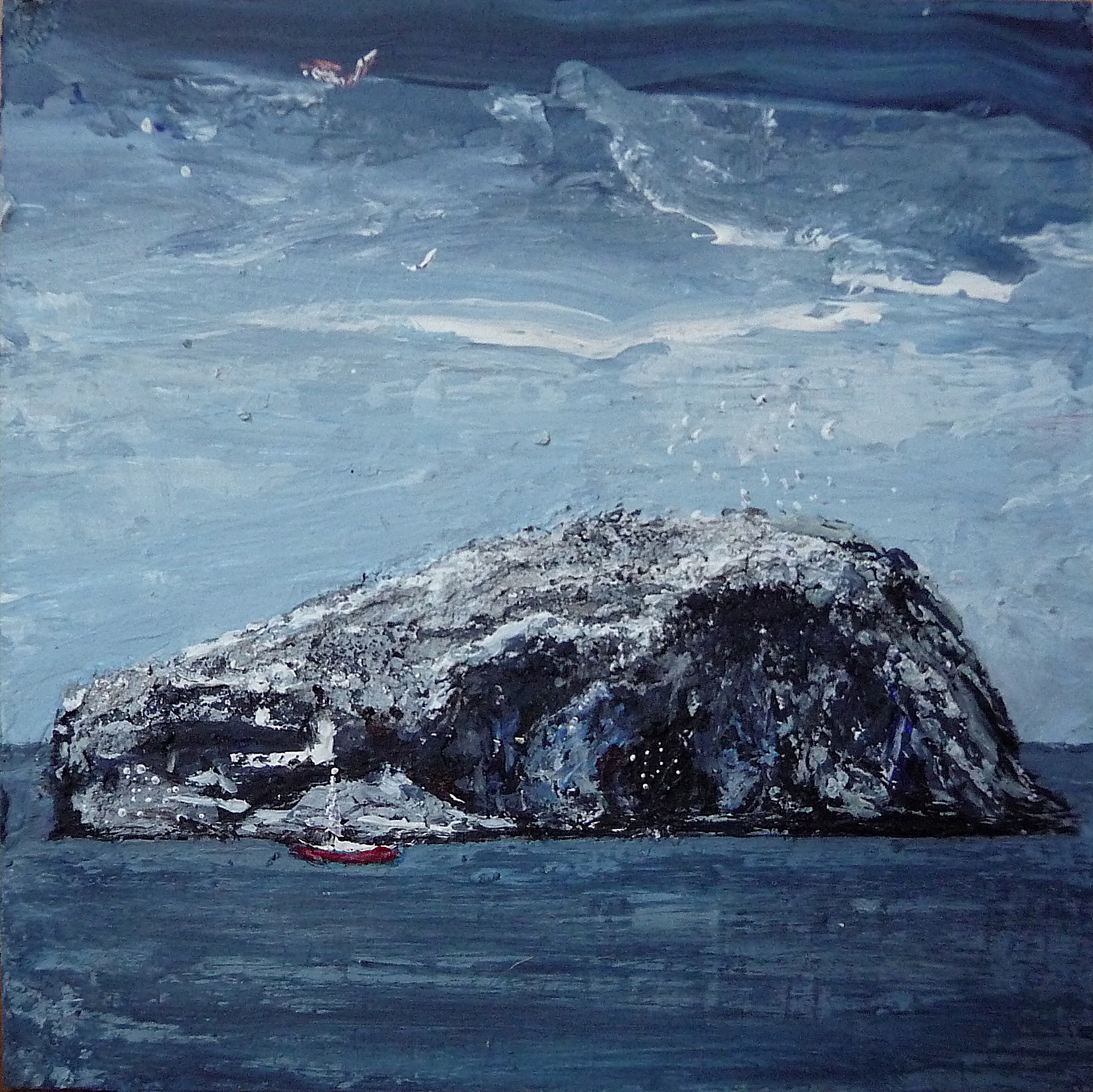
I’m playing around with this painting in an experimental way, somewhere in the process I’ll maybe wipe out the whole thing and start again. I quite like the layered look and texture this gives to a finished painting, and it echoes the themes I’m exploring of impermanency, which is a shorthand for concepts I’m exploring instinctively rather than intellectually at the moment. I’ll know when the mood feels right.
On the subject of impermanency, I’ve noticed in the past few years is that less people are buying paintings, this is echoed by the chats I’ve had with artists and gallery owners recently, so I know it’s not just down to my paintings as such! With working tax credit cuts coming up at the start of 2016 a lot of artists are facing tough times ahead. Unless they’re famous, most artists have a part-time job to supplement their income, which is on average about £8,000 £10,000 per year. Apparently the minimum wage will rise to £9. Don’t spend it all at once folks!
Artists are obviously just one small group facing difficulties, and I share the anger of millions in the UK just now, at the increasingly grim implications for everyone on a low income, unemployed, struggling families, pensioners whose fuel allowance is about to be cut, people with illnesses or disabilities or young people struggling to envisage a hopeful future where they might fulfil their potential.
Out of interest though, this article compares other country’s attitude to the arts – http://www.theguardian.com/culture-professionals-network/2015/jan/12/artists-low-income-international-issues
And here’s a report on the survey about UK artist income carried out by DACS http://www.dacs.org.uk/latest-news/artist-salary-research?category=For+Artists&title=N
I’ve been lucky enough to get the odd curatorial job in the arts and health field in the past, but let’s face it the NHS won’t be splurging on arts projects in the coming years. I’m not complaining on a personal level, I don’t have kids or huge responsibilities, I’m just adjusting to the current economic fantasy as presented by the tory government, more fantastical by far than my paintings, less permanent than Cockenzie Power Station given it stood there so long, the point being that things change, and there’s always hope.
I’m left to ponder in bemusement at those people who believe tory spin about being frugal with the economy, as though it’s comparable to a household budget. God knows I’m no expert on economy, my seven or so years of education (which I paid for with loans and by working as a flower picker and part-time cleaner lest anyone assumes I’m a pampered arty type!) was in the arts, but I can at least understand the concept that investing nothing, and taking more and more, not just from those on benefits, but from ordinary working people, means people spend less.
How many houses, services, clothes, or paintings, for example, can a super rich person buy?! We know that 40% of the UK are on some form of benefits now, so it doesn’t take a genius to work out that what’s left of the business owning middle classes, not to mention those facing cuts in public services will be really feeling it soon. Bye bye arts career, not that I’d ever stop painting…
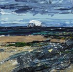
In the meantime, if you’ve read this so far, you might welcome some tranquility in the form of a few works by some of my favourite painters, I’ve been gazing on some of these today, most inspiring..
-
-
Raphael Egli ‘UFO’
-
-
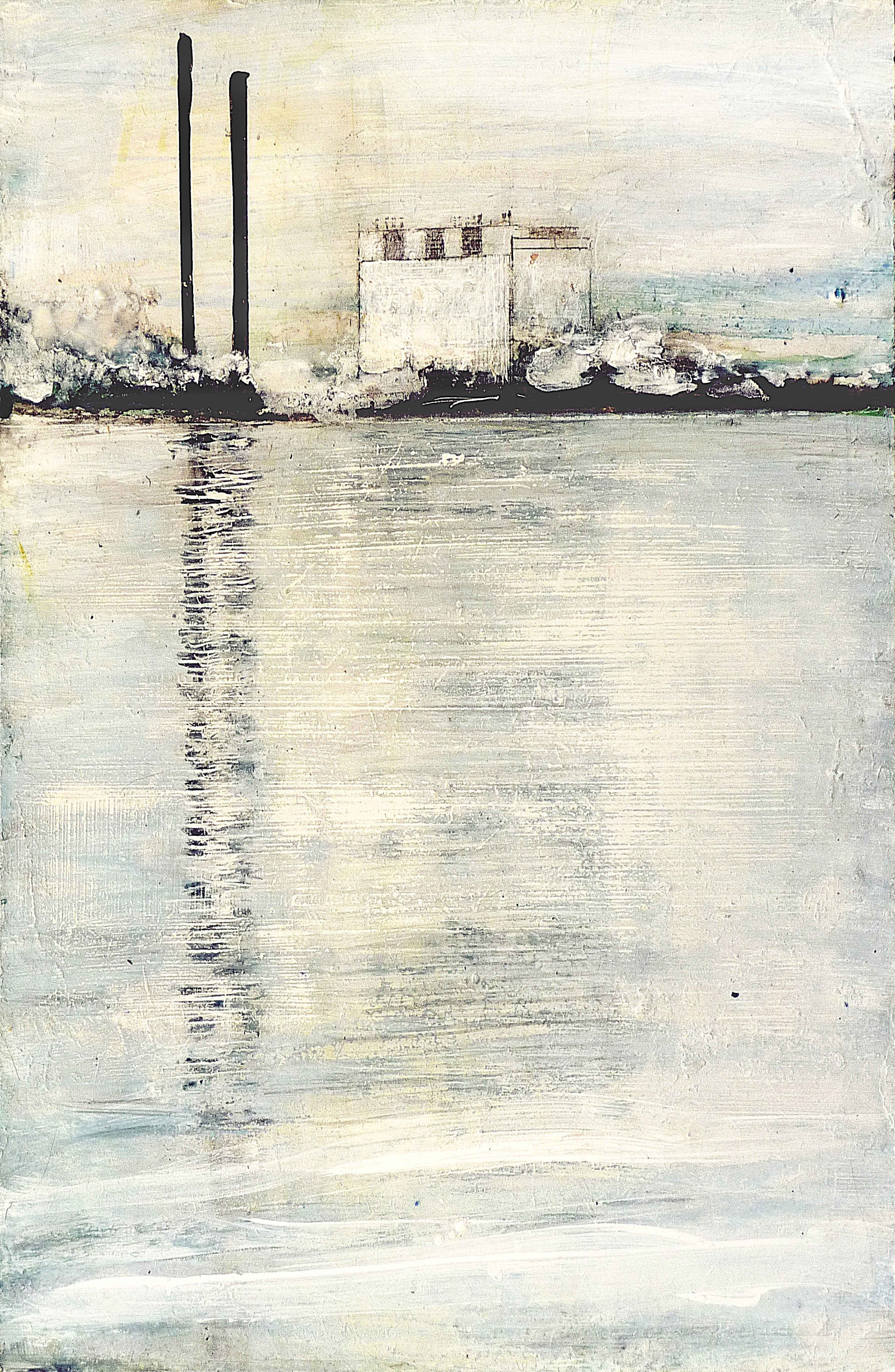
Kate Downie ‘Orfrenda (the Thames)’
-
-
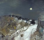
Joan Eardley ‘Catterline in Winter’
-
-
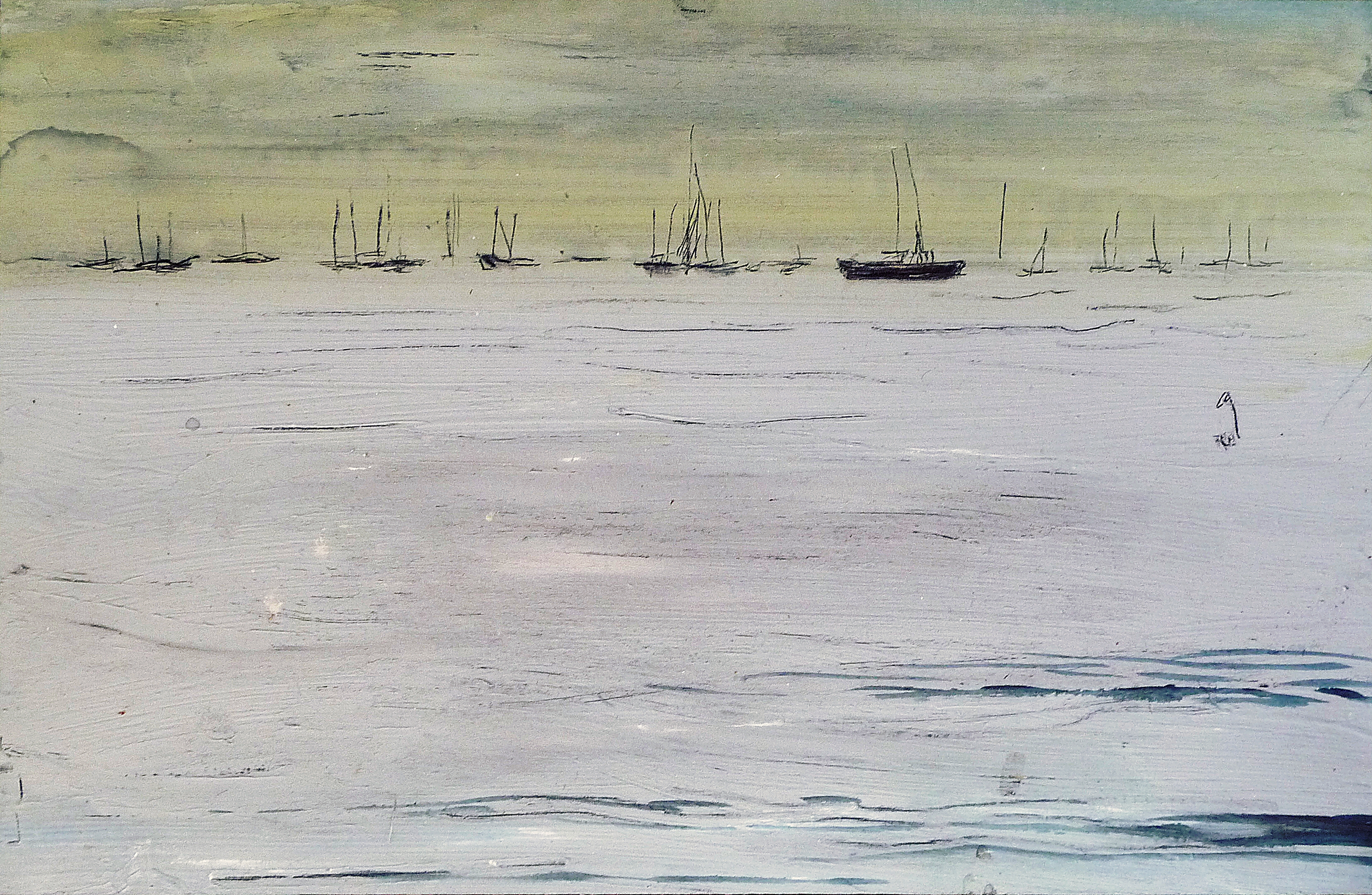
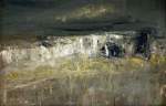
Joan Eardley ‘A Stormy Sea’
-

-
Jospeh Beuys ‘Stag’
-

-
Peter Doig. ‘Imaginary Boys’
-
-
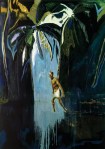
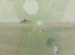
Peter Doig ‘Pelican (Stag)’
-
-
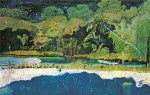
Peter Doig ‘Grand Riviere’
-
-
Yee Jan Bao (title unknown)
-
-
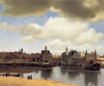
Vermeer ‘Delft’