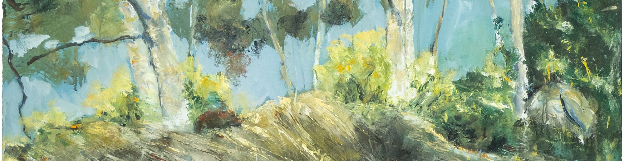

Above: Spring Sycamore. Acrylic on 20×16″ canvas. Rose Strang 2013
As I’m currently painting a private commission which must remain secret until October 2021, I thought I’d post themed blogs in the meantime. Today’s theme is Trees.
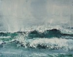
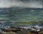
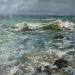
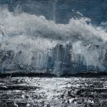
My last theme was Sea. In the next few weeks I’ll also share my paintings on the themes of mountains, portraits, winter, abstraction, imagination and collaborations
It’s easy to imagine dryads or sidhe (faerie folk) hiding behinds trees in ancient forests. Many children’s stories or fantasies are set in the woods; think Tolkien, C.S. Lewis, or Robin Hood! Trees seem to spark imagination – for good or ill (think of all those spooky tales or films set in forests!) I’ve wondered why this is – perhaps it’s the fact that in a forest so much is hidden – it’s a metaphor for the unconscious, for the unlawful and rebelious.
I find that painting trees requires loose brushwork (or loose line if it’s drawing) though in a different way from sea painting – not so much gestural as allowing the paint to drip and splash, leaving patches to imagination, with a strong sense of light/dark to bring depth so the viewer is led into the forest.
When painting forests of the Scottish Borders in 2014, I was inspired by the last line of a Borders Ballad called Erlinton, about a girl who escapes to the forests to be with her lover; now we shall walk the green-wood free. To me that line beautifully evokes the idea of Medieval tapestries and tales. So with that in mind, to enhance your viewing pleasure of the tree paintings below, here’s a music piece for lute by William Byrd – Will you Walk the Woods so Wild – Byrd
Or if you prefer, here’s a beautiful performance of Dvorik’s Silent Woods from From the Bohemian Forest – Silent Woods
I’ve headed each set below with these terms: Spring Summer Autumn Winter
Spring
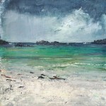
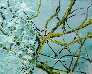
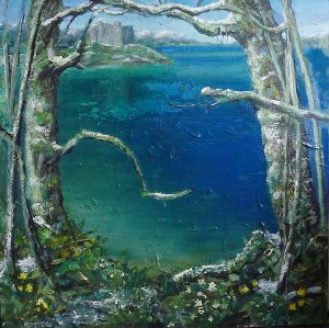
My favourite time of year – from the softening of air in March, to the explosion of flowers in April and May. I think it’s inspired my best tree paintings! Spring Sycamore, below, was bought by my dad in 2013. Probably because it was painted after a walk we took in spring near Queensferry. My dad passed away in 2016 and is remembered with great love by everyone who knew him. When we were kids he’d make tree swings in Queensferry forest with lassoe techniques on the highest branches of huge beech trees, so you could swing down an entire valley, terrifying at first, then exhiliarating! As he used to say, tongue in cheek (perhaps?) ‘if a kid isnae terrified it’s no a proper game’!
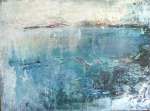
I was quite happy with the minimal paintings from the Water of Leith series below, I wanted to capture more with less (they’ve not sold though!) Spring Chinoiserie was a bit of a nod to Pollock, who expressed the energy of nature with rhythmic drips and splashes of household paint. Some works here – Pollock
Bare trees are all about lyrical line – I’m also thinking of beautiful tree drawings by the wonderful illustrator Pauline Baynes. Link to her drawings – Baynes
-
- Sold. ‘Spring Sycamore’. Acrylic on 20×16″ canvas. Rose Strang 2013
-
- Sold. ‘Spring Chinoiserie’. Acrylic on 20×16″ canvas. Rose Strang 2013
-
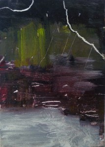
- NFS ‘Water of Leith. 7’. (Diptyque) Oil on 7×5″ wood. Rose Strang, May 2020.
-
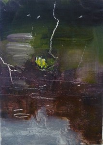
- NFS ‘Water of Leith. 8’. (Diptyque)Oil on 7×5″ wood. Rose Strang, May 2020.
-

- NFS ‘Water of Leith. 2’. (Diptyque). Oil on 7×5″ wood. Rose Strang, May 2020.
-

- NFS. ‘Water of Leith. 3’. (Diptyque). Oil on 7×5″ wood. Rose Strang, May 2020.
-
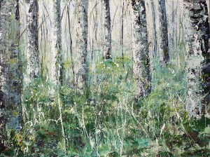
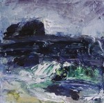
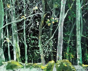
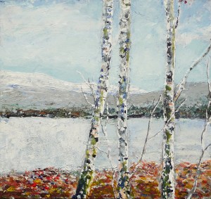
- Sold. ‘Birch Trees, Gladhope’. Mixed Media on 40×30″ canvas. Rose Strang 2014
-
- NFS. ‘Planets Series. Jupiter’. Mixed media on 40×40″ wood panel. Rose Strang 2018.
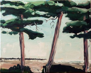
Summer
Emma and Friends (below) captures something of the idyllic feel of summer I hope. It’s of my niece and her friends after they’d completed their final school exams. They took a swim in the River Tweed and the green light of summer transformed them into luminous mythical nyads! Most of these tree and forest paintings in 2014 were from a series inspired by Borders Ballads, as mentioned in my intro above. Technique-wise, I was more than a little inspired by a painting I love by Peter Doig – scroll down on link to ‘Concrete Cabin’ – Doig
-

- Sold. ‘Emma and Friends, River Tweed, 2014’. Mixed media on 11×11″ wood panel. Rose Strang 2014
-

- Sold. ‘Wood Cabin (Leithen’. Mixed media on 20×16″ canvas. Rose Strang 2014
-
- ‘Glentress’. Acrylic on 20×16″ canvas. Rose Strang 2014
-
- ‘Scots Pine near Coldingham’. Mixed media on 20×16″ canvas. Rose Stranfg 2014

-

- Sold. ‘Tweed River near Peebles 2′. Acrylic on 5×5″ wood. Rose Strang 2014
-

- ‘Still Pond (Sussex)’. Acrylic on 20×16″ canvas. 2014
-

- ‘Neidpath Castle on the River Tweed’. Mixed media on 10×10″ wood panel. Rose Strang 2014
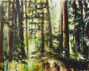
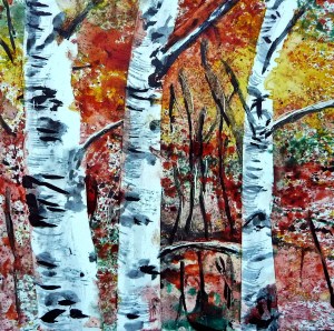
Autumn
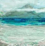
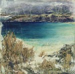
Autumn can crackle with electric blue skies and neon oranges, or glow gently in a somnabulic way that makes me feel pleasantly gloomy and introspective. It signals hibernation to come, decay and the passing of time, with the smell of mulchy leaves and woodsmoke in the air, it’s almost clichedly poetic I suppose. Last year I’d planned a series inspired by October in a Highland mountain valley, but the focus for now is my current commission (to be revealed in October this year).
Gustav Klimt’s birches are unsurpassed I think – Klimt
-

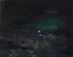
- Sold. ‘Winter Miniatures. Sunset’. Mixed media on 3×3″ wood. Rose Strang 2019
-
- Sold. ‘Autumn Birch’. Mixed media on 5×5″ wood panel. Rose Strang 2013
-

- Sold. ‘Water of Leith. 9’. Oil on 7×5″ wood. Rose Strang, 2020.
-
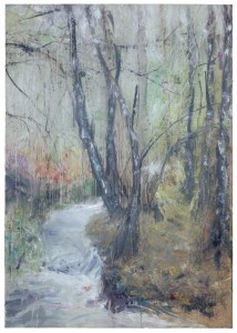
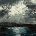
- ‘Glenfinnan, Forest and Stream’. Oil on 33 x 23″ wood panel. Rose Strang 2020
-

- Sold. ‘Glentress Forest 2’. Acrylic on 20×16″ canvas. Rose Strang 2014
-

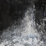
- Sold.’Forest of Ardban’. Oil on 20 x 10 inch wood panel. Rose Strang 2020
Winter
Although spring is my favourite time of year, winter is endlessly inspiring creatively. The starkness and subtleties of tone make us focus on line and contrast. The monochrome work below; Canonhill Park – is the only time I’ve used a very definite technique as oppposed to experimental – the white blobs are impasto against a black ink flat background, I quite liked it it, but only for this one-off subject.
The paintings of Scottish artists Calum McClure and Andrew MacKenzie focus on line and nature, rather than colour. Winter trees feature in much of their work. McClure’s paintings are lyrical, loose and painterly, MacKenzie’s are more contained, with minimalist composition and delicate line – McClure
Lastly, no post about trees would be complete without mention of Arthur Rackham. For anyone brought up with books featuring Rackham’s illustrations, ‘Rackham-esque’ is an unofficial term for magical-looking trees! Rackham
-

- Sold. ‘Winter 5 – Ice Lake’. Mixed media on 10×10″ wood panel. Rose Strang 2017
-
- Silver Birch. Acrylic on 10×10″ wood. Rose Strang 2013
-

- ‘Winter Birch’. Mixed media on 5×5″ wood. Rose Strang 2013
-

- Sold.’Winter Miniatures. Snow on Arthur’s Seat’. Mixed media on 3×3″ wood. Rose Strang 2019
-
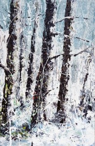
- Sold. Winter Birch. Mixed media on 17×11″ wood panel. Rose Strang 2015
-
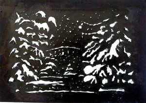
- Sold. ‘Bridge in Winter, Canonhill Park, Birmingham’. Acrylic and ink on 7×5″ card. Rose Strang 2013
In the next blog the theme is mountains