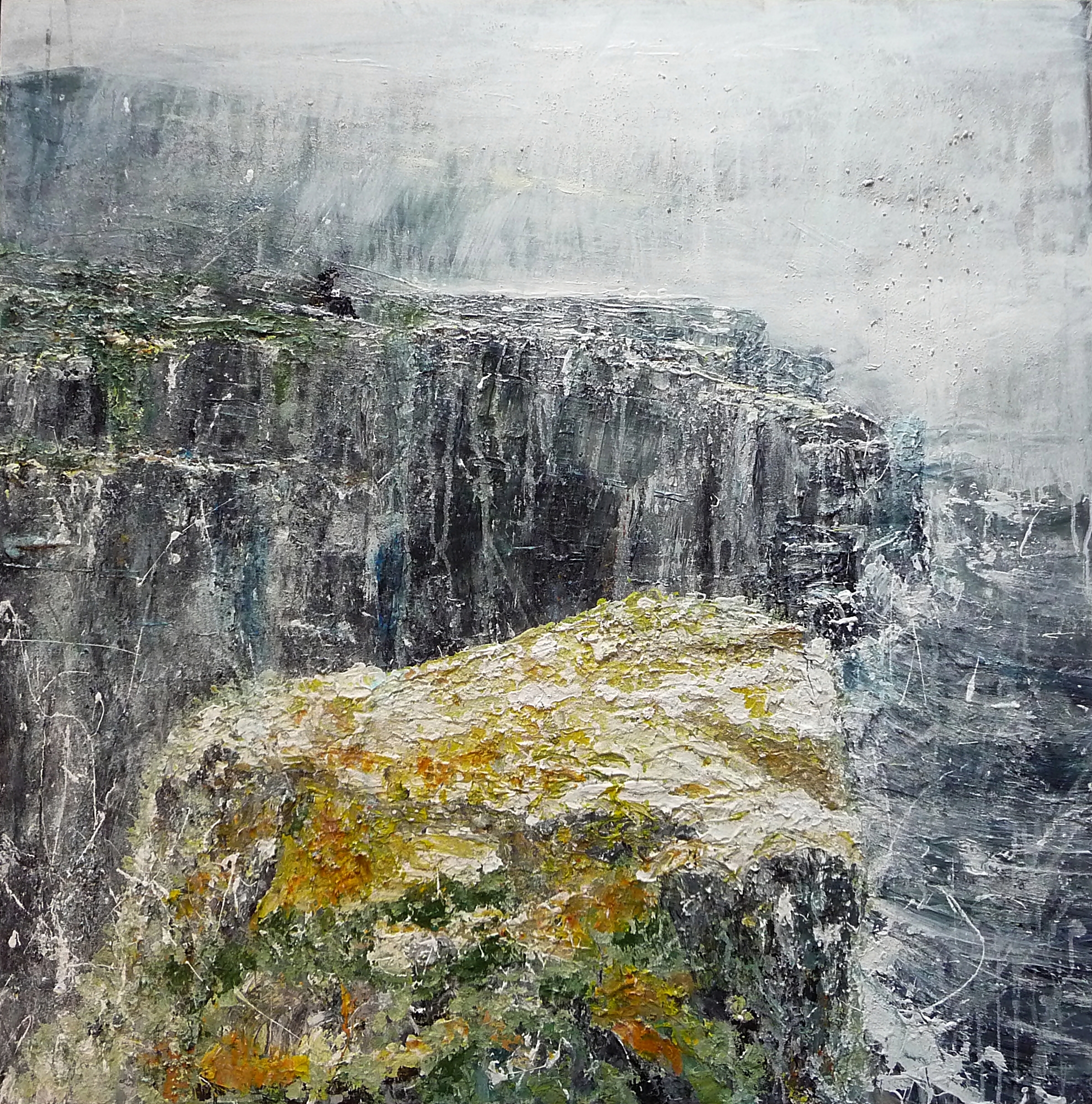
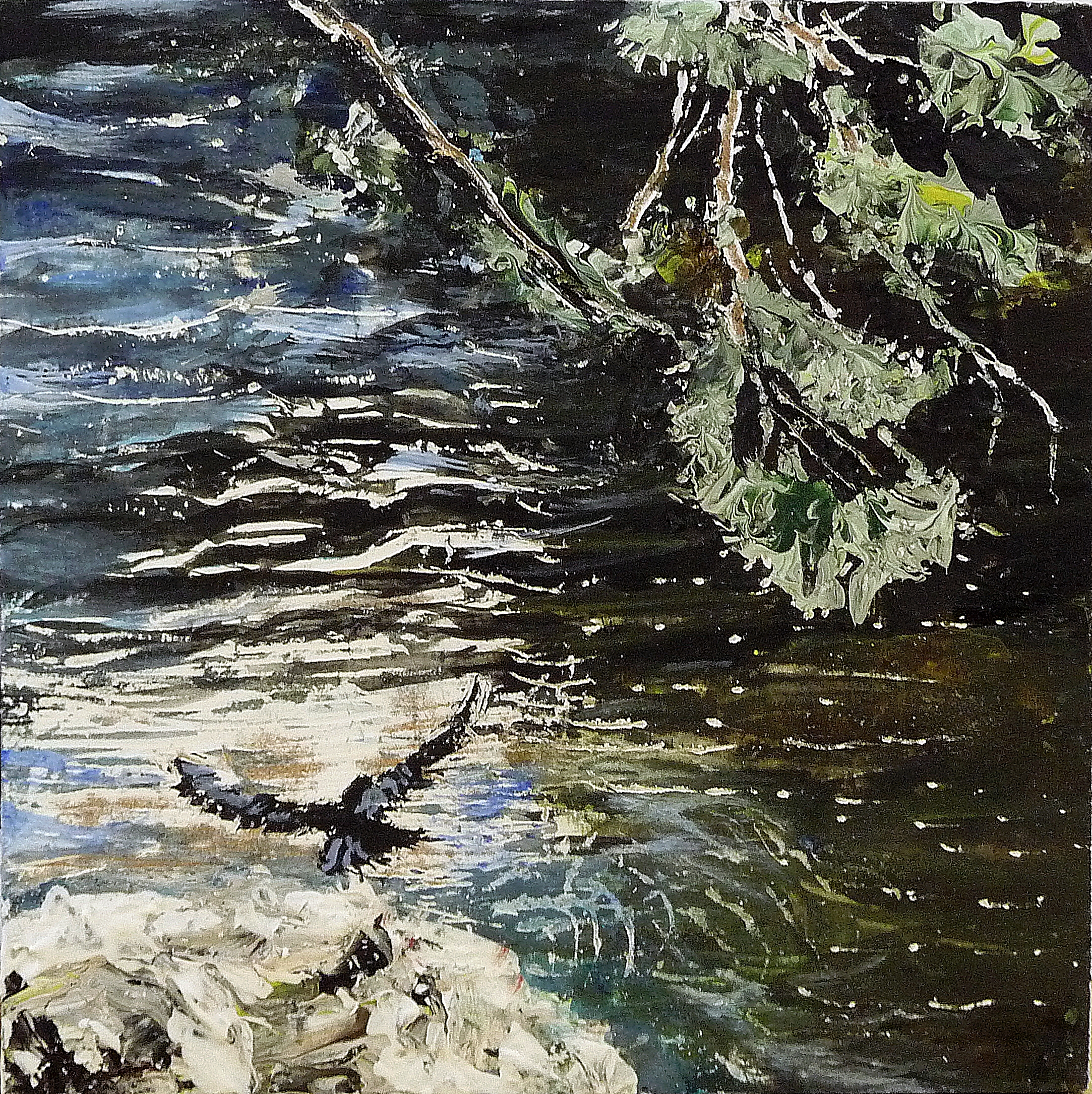
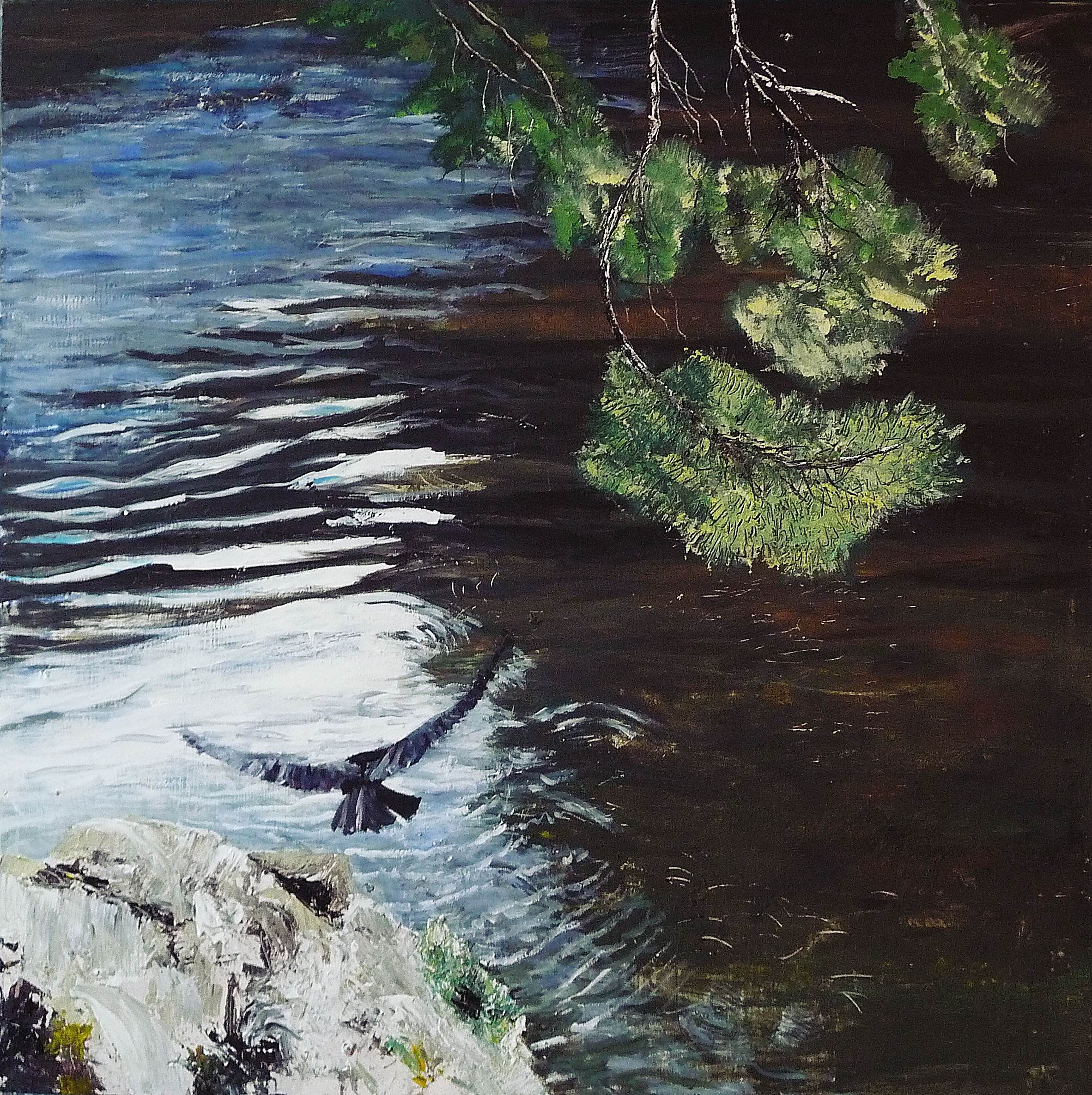
‘Hawk. River Tweed’. Acrylic on 5×5″ wood
Recently someone mentioned they’d watched the video of ‘Hawk, River Tweed’ (below) which shows me in the process of painting ‘Hawk’ on 40×40 inch wood.
They’d liked the video, but felt the whole thing had whizzed past so they didn’t get a sense of technique, which comes as no surprise really since I don’t really like to think too much about technique before starting, it’s more instinctive and experimental.
Then again though, my choices are based on years of painting, so I decided to look at the painting again and analyse the way it was painted, so read on if you’re interested in painting approaches and techniques!
Firstly, the video shows small clips of a process that took a few days (here it is if you’d like to watch it first)…
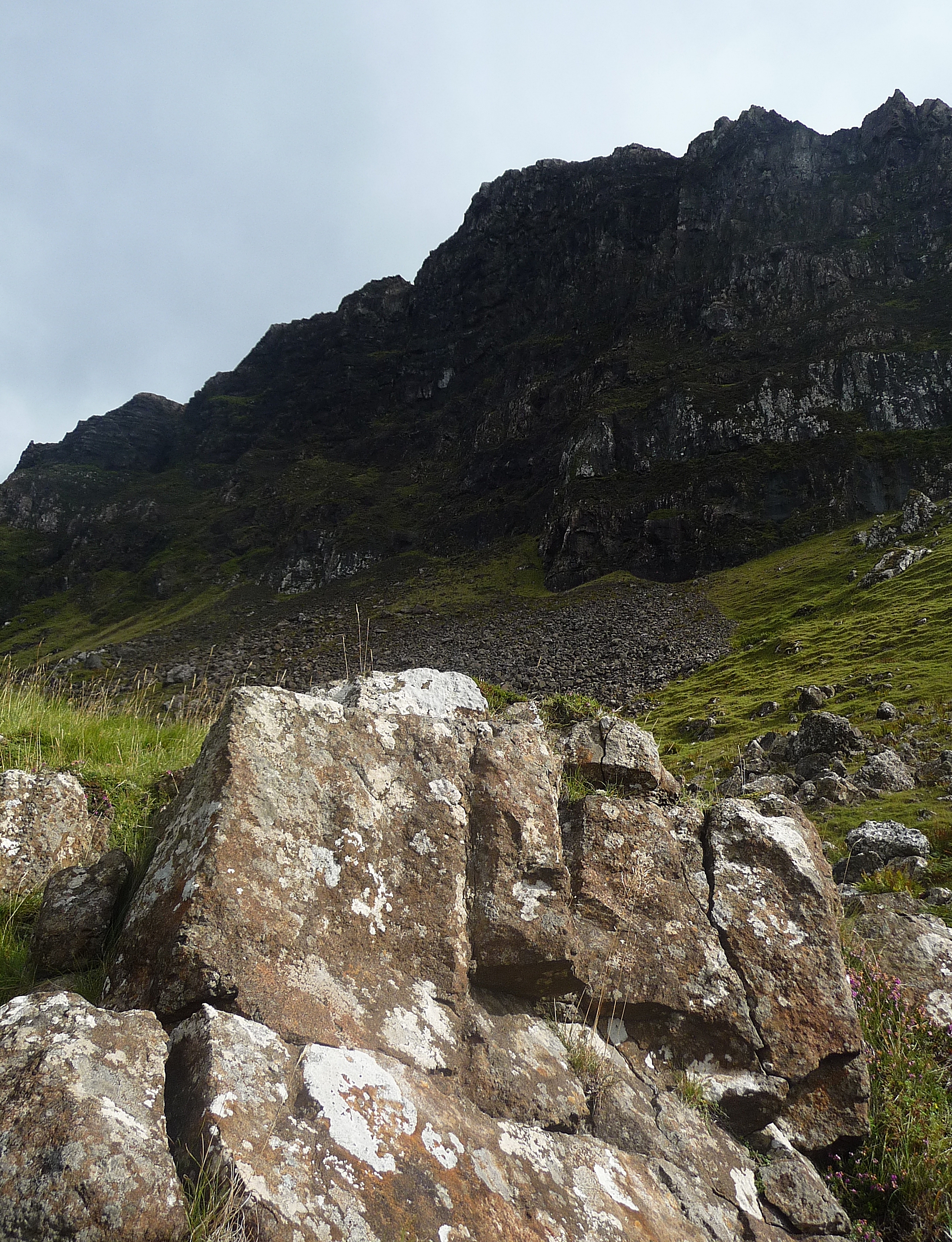
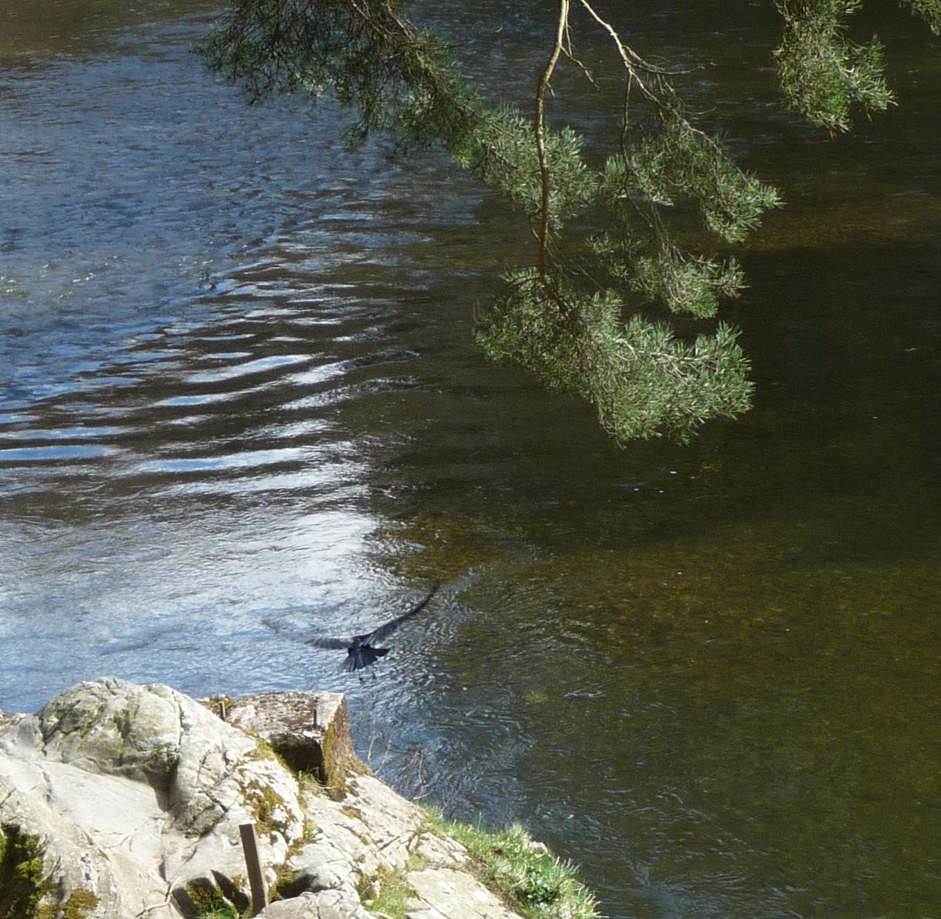
I often work from photographs and sketches taken of the original subject. ‘Hawk’ is from the River Tweed near Peebles. I was simply taking photos as I walked, and didn’t have time to stop that day. I was trying to photograph a diving hawk, and in these photos you can see it hovering then swooping to catch a fish. (Unfortunately I didn’t capture the fish-catching part as my digital camera has a slight delay between clicks!)
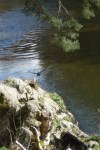

So in this case the painting was done entirely from a photograph, in a fairly straightforward way. Often I’ll use the photo as a starting point then depart quite radically from the original, adding contrast, changing composition and colour, or adding experimental effects.
I began with a small study on 5×5 inch wood (at the top of this post). I did a second version on 20×16 inch canvas (upright, portrait style) which also worked well composition-wise. I felt that horizontal landscape somehow didn’t suit the subject, which is dynamic. Landscape feels calmer to me, more settled.
I decided then to create a very large version on 40×40 inch square panel.
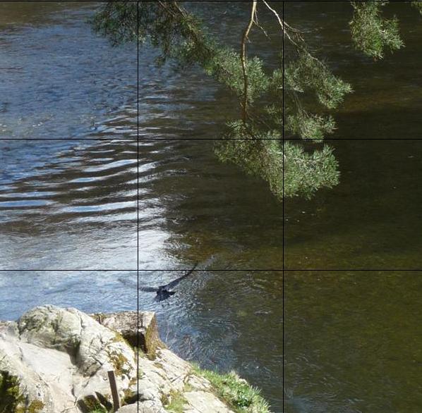
Although I wasn’t thinking of the golden mean when making these original decisions, for this post I thought it would be interesting to retrospectively place a grid over the cropped photo and the painting. As you can see in the two photos below, the hawk hits the lower left intersection, and is echoed by the top-right diagonal of the trees. The rock is within the lower section and most of the tree is in the top right. Both tree and hawk break through the lines a little though. I think it creates a tension – you know the hawk is about to turn right and swoop down, the branches point the way.
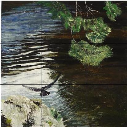
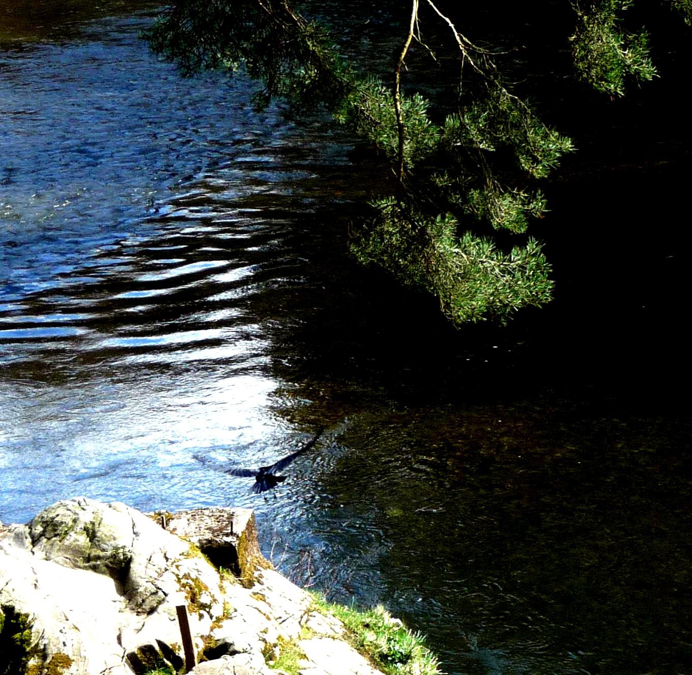
In the painting I’ve instinctively exagerrated these points – the right branch hits the line exactly, the left branch swoops towards the upper right cross-point, the hawk is bigger and its body almost hits the lower left intersection. The rock is tighter into the lower left, which creates more tension.
The golden mean was invented by Renaissance artists. It was based on mathematical harmonies found in nature and used by artists as a means of balancing composition. If, for example, you’re painting a seascape, you’ll decide whether to start the sea-line/horizon in the bottom section, or the top. Halfway up is tedious. If you’re adding the sun and a boat, for example, you’ll place them at the intersections. This just seems to work, but artists can obviously disrupt this to create unsettling effects.
Squares are a less obvious choice for painters, they make the composition more tricky to carry off. I tend to think the square format suits close-up subjects, or very simple compositions.
On to the painting..
One of the first things painters learn to do, is pinpoint the darkest and lightest areas of the composition. Laying down almost black paint can seem far too heavy at first, but the more contrast the painting has, the better.
At this stage the artist is also working out pattern and scale – how the patterns fit on to the canvas or surface. There are several ways to ‘see’ more clearly, half shutting your eyes creates contrast and makes the patterns stand out. Try it just now – look at this photo and see how dark and light jump out when you screw-up your eyes almost closed. It makes the mid tones disappear.
You can also turn the contrast of the photo up high on your computer..
Or turn it upside down..

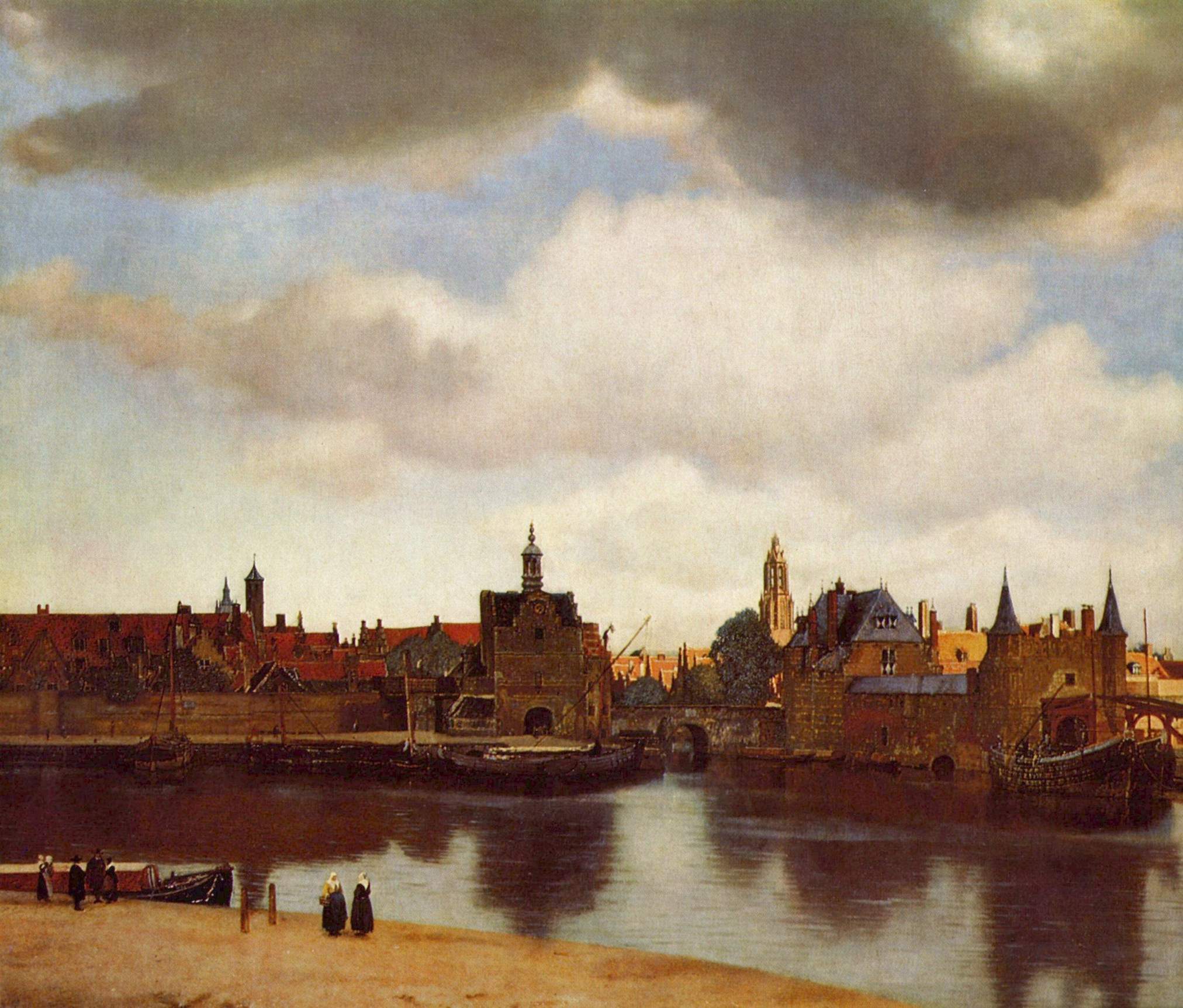
This might seem a bit like cheating, but it’s exactly what painters have been doing for centuries. A camera obscura, used by Vermeer for example, not only showed more contrast in a photo-like way, it also turned the subject upside down. His pictures do have a high contrast that’s almost photographic; very clear and precise..
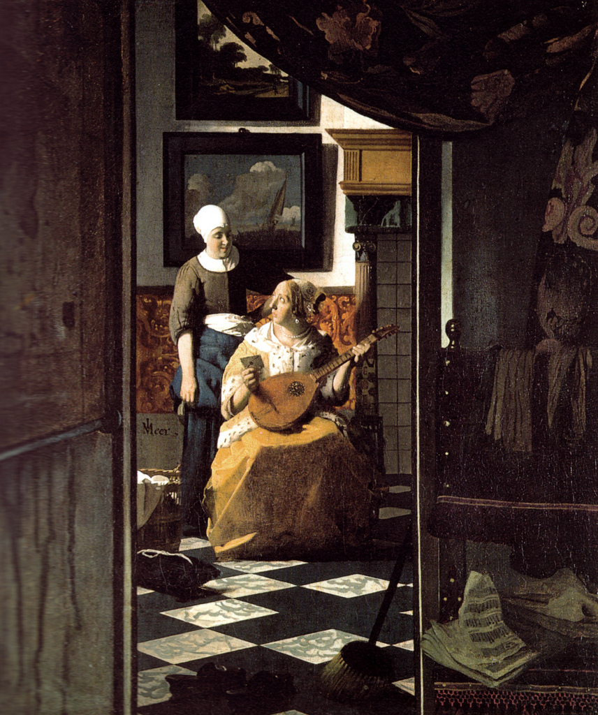
Jan Vermeer – Love Letter, 1670 at Rijksmuseum Amsterdam
You don’t paint the entire picture upside down mind you (and obviously Vermeer was a genius at capturing the quality of light as it falls on subjects, which is about so much more than contrast). It’s just a good starting point to understand what you’re seeing, because basically the average human eye sees too much and we need to simplify at first to understand the main principles of the image.
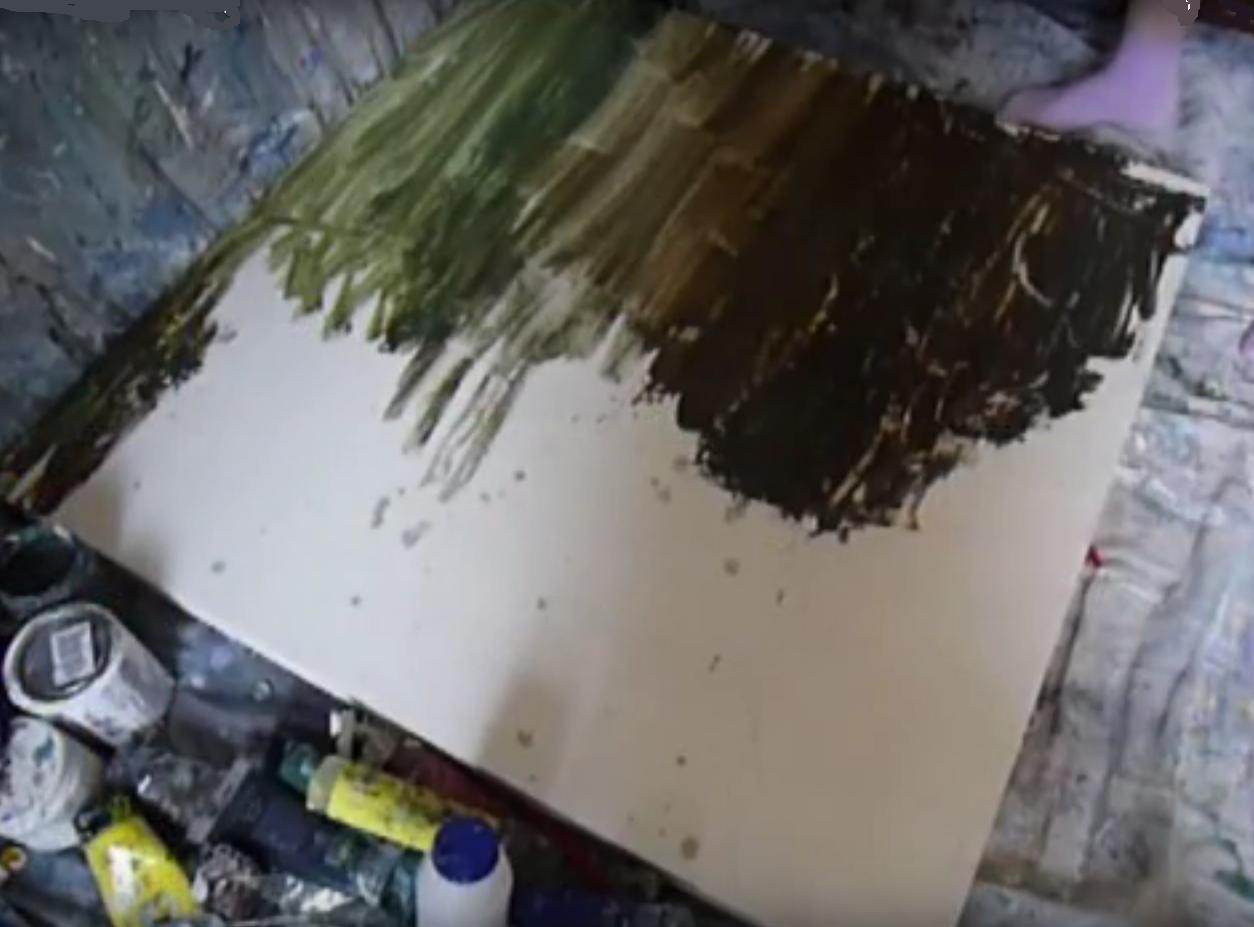
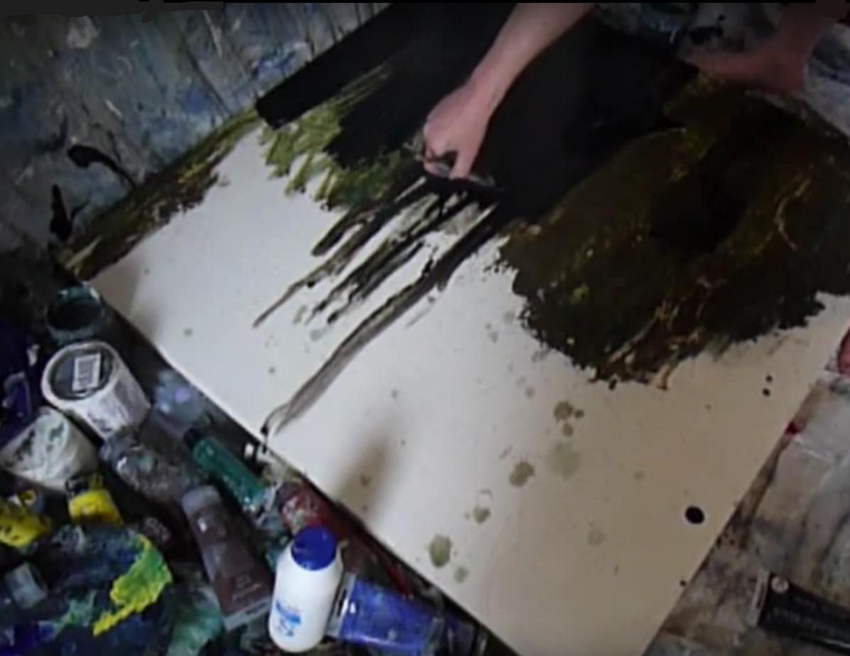
I began with the wood panel flat on the ground. This was because I knew I’d be using a lot of water in the early stages and I didn’t want the paint to run.
The surface is primed with several layers of white gesso. This seals the wood and gives a plain white surface to paint on.
I roughly drew in my composition with pencil, clearly marking out the lightest areas (above the hawk and the rock formation in the bottom left). I intended to leave the water highlight blank for really bright, crisp highlights.
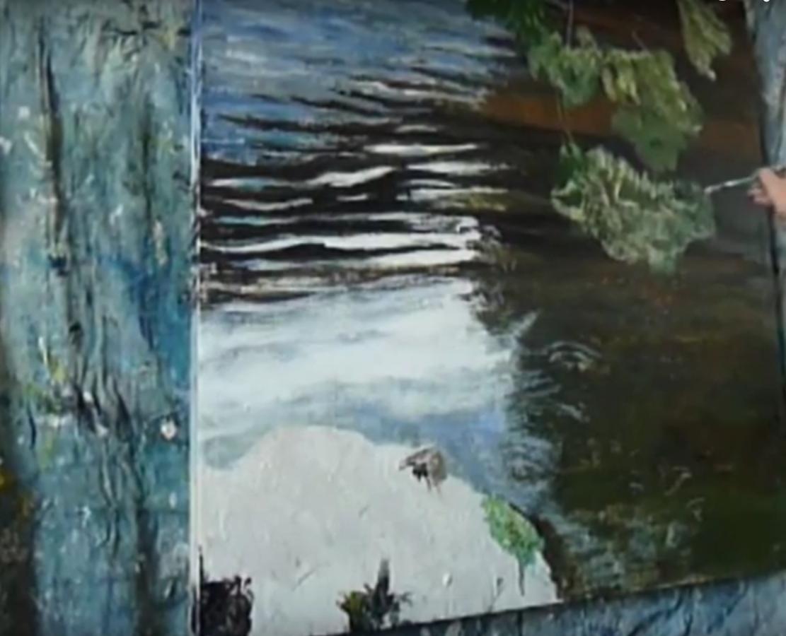
After laying down some basic gold/green/brown colour on the right of the painting, I painted in the darkest areas in pure black with a household decorating brush (why waste time with little brush strokes?!) then dabbed with a cloth here and there to break up the tone somewhat.
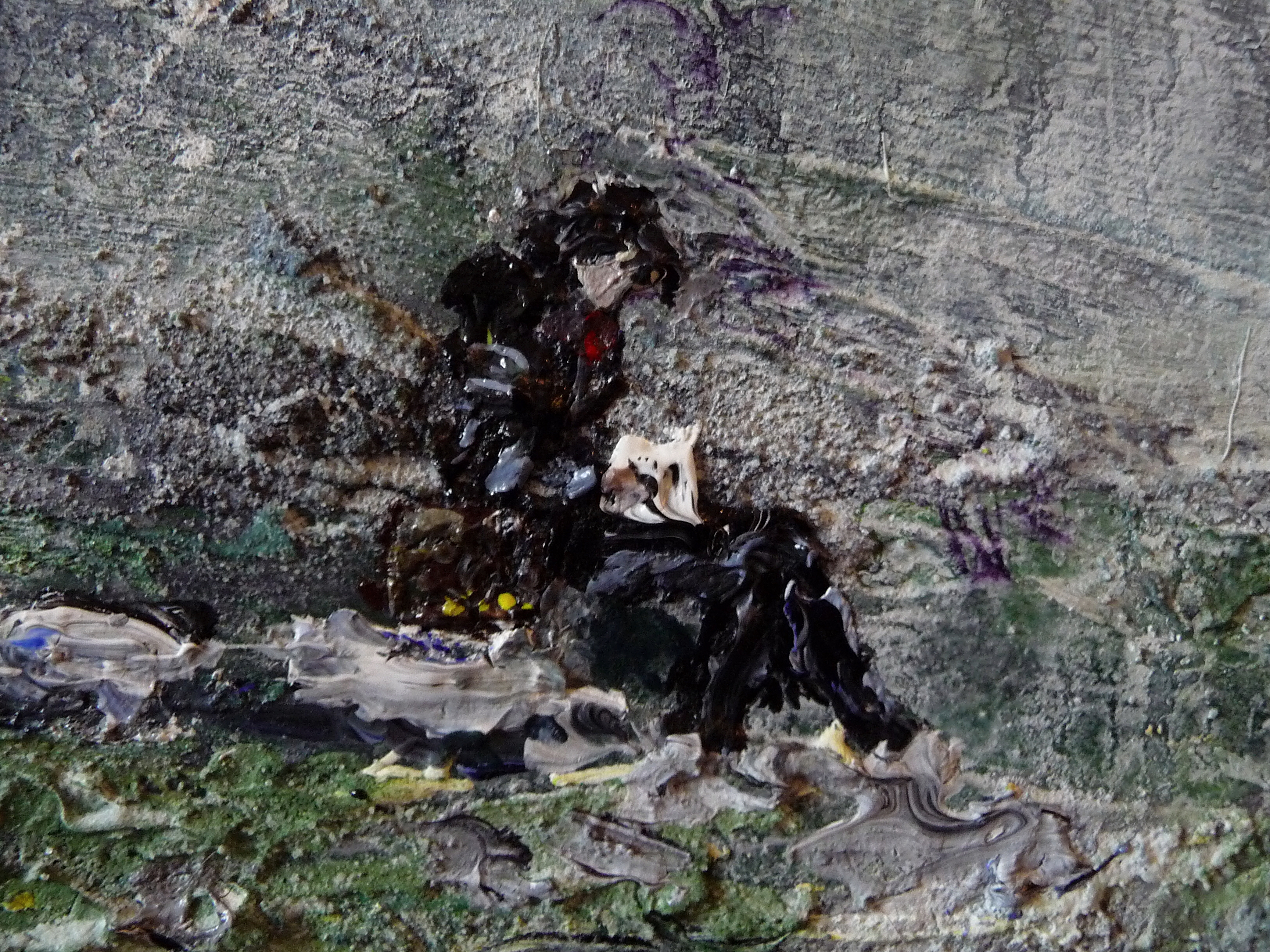
The black lines showing rivulets on the left were important to get right, in fact these were the trickiest part of the painting, getting these patterns right was essential to capture the way the water flows.
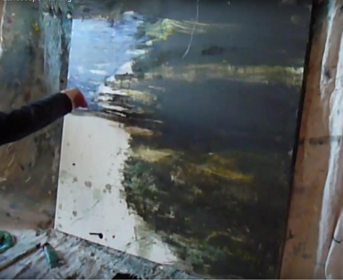
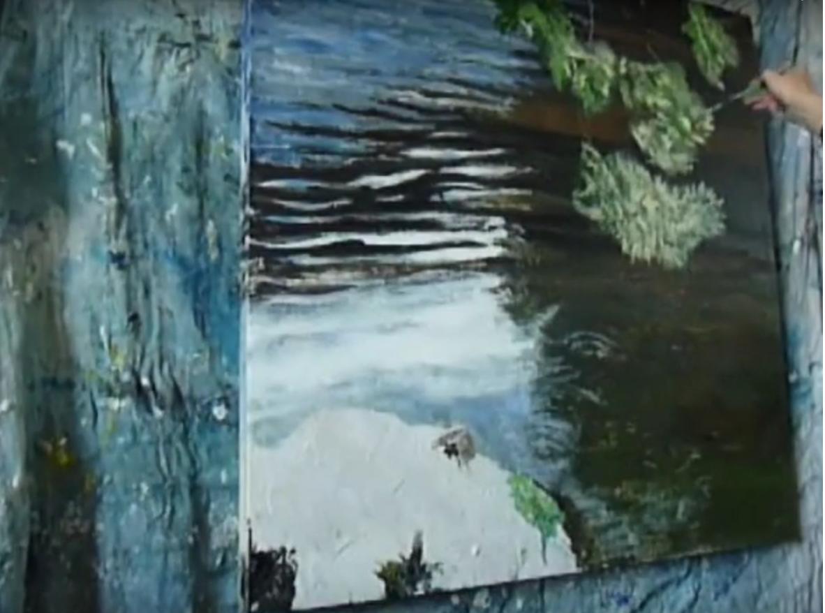
The next stage was capturing the beautiful peaty/gold water with pebbles beneath. One way of painting this would have been literal copying, but I love to add texture and serendipitous effects, so I first created a wet puddle of brown, yellow and green paint. Then threw down salt, which makes the paint pool and flow in interesting ways.I scraped into the wet paint to reveal the pale gesso below and create nice areas of translucency.
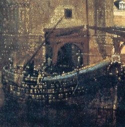
When dry, the salt creates a gritty texture that you can add to with light brush strokes that just brush the surface of salt granules creating the effect of tiny points of light. (I discovered recently that Vermeer also used salt, particularly in the distance on rooftops to get the sense of light hitting the surface.) Also, salt creates subtle light changes as you move around the painting, catching light in different ways.
Here’s Vermeer’s ‘Delft’ with detail where you can see the way he let the canvas show through, and used texture or rhythmic broken areas to create light effects..
I let the puddle dry out for a night and day, then propped the painting upwards somewhat. I would still be using quite a lot of wet paint, so delayed hanging the painting at this stage.
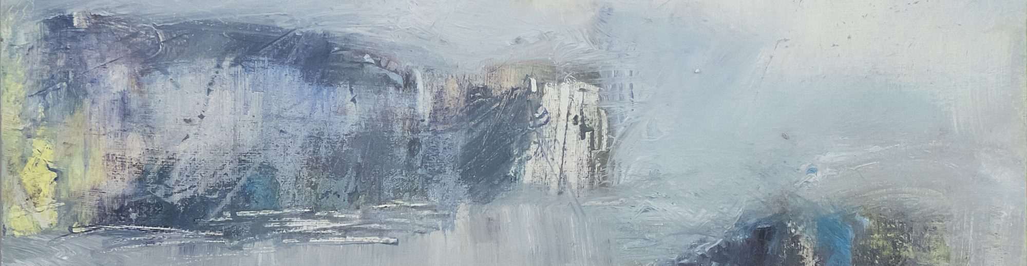
I quickly brushed in dark blue/grey/white, with subtler light and shade in the top left quarter of the painting. Then began to work more on the tricky black lines on the left, with blue and lighter tones.
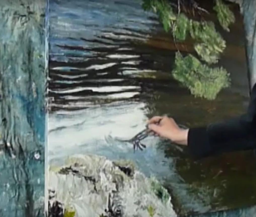
For the bottom left rock, I began to use a pallete knife. Mostly because this adds thick texture and interest, a nice contrast to translucent water.

I also used a pallete knife for the branches. I liked the way the broken line created by the pallete knife echoes the way light fell randomly on the branches, showing the textured feel of Scots Pine branches.
I blotted in the darkest green areas of the green pine needles, then let this dry before blotting in quite bright, thick yellow. I used a fan-shaped paint brush, which is a great short cut for creating the regular shapes of leaves or distant branches etc.
This didn’t capture the spindly pine needles effect though, so I scraped in lots of rhythmic vertical lines with the tip of the pallete knife.
I painted the hawk using a small, flat brush and varying shades of blue, black, green, purple and grey. This is one part of the painting that had to be absolutely precise. Leaves and water can have varying edges, but everyone knows the shape of a hawk! To balance their hand, artists often prop one finger against the surface, but practice and confidence makes the hand steadier. It’s about decisive mark-making – with a feel for flow, softness or energy and so on.
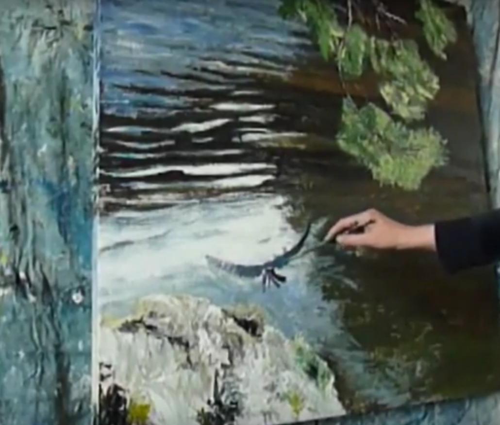
(I remember one early life drawing class back in the eraly 90s, where the tutor asked us to attach our charcoal to the end of a long paint brush so we wouldn’t work so closely to the painting, it means you have to make decisive, smooth strokes because the further away you are from the canvas, the less control you have. Yet, this makes your hand bolder, paradoxically).
Finally, with the exhibition deadline looming, I later I covered the entire painting in two layers of varnish, panicking slightly as I thought maybe I’d not left the underlying paint to dry long enough (this can create nasty opaque areas) but by the next day it looked fine, phew. Varnish lends depth to the painting as well as protecting it, and it usually really enhances water too.
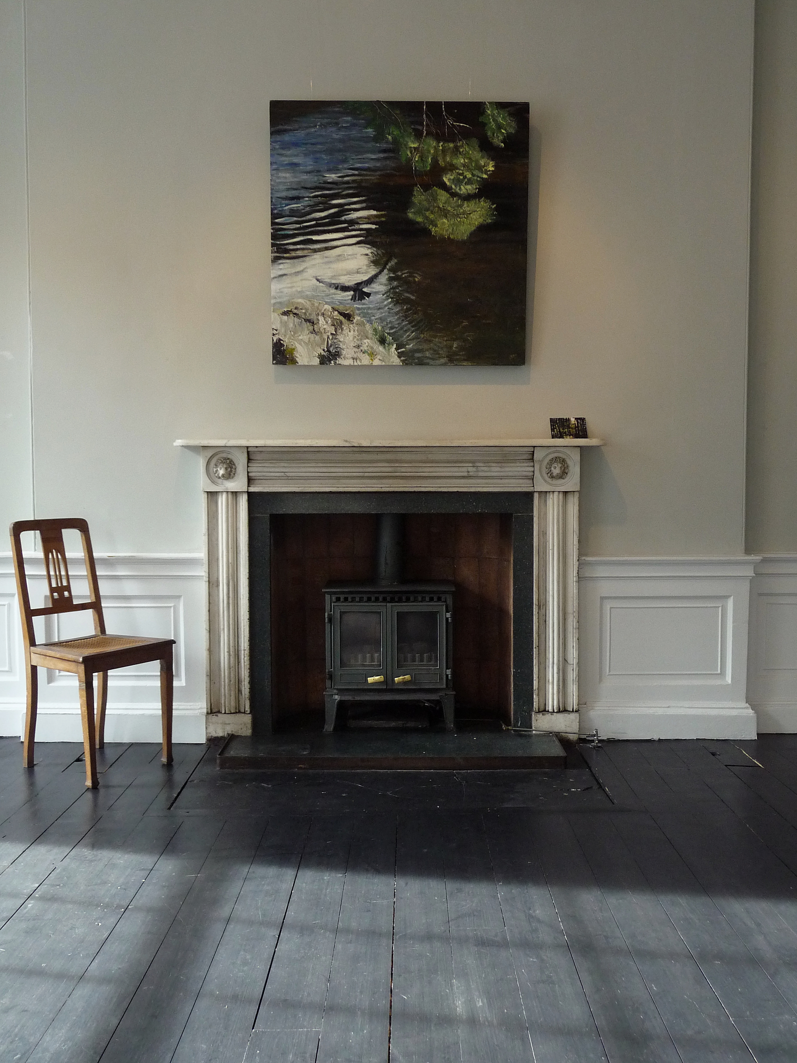
Here’s the final painting, and in the exhibition…
‘Hawk, River Tweed 3’. Mixed media on 40×40″ wood panel