Monthly Archives: February 2016

Nocturn lines, light and sound

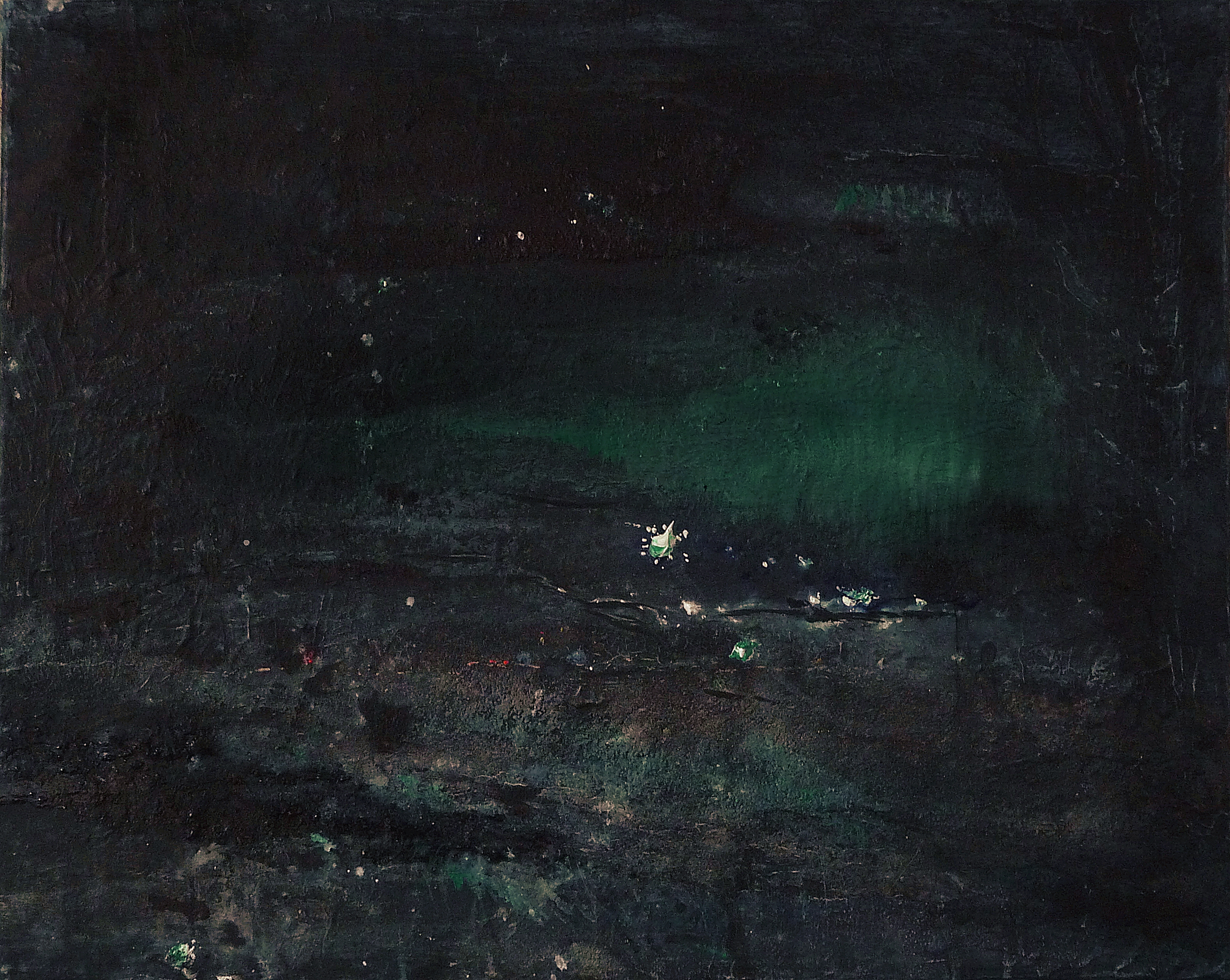
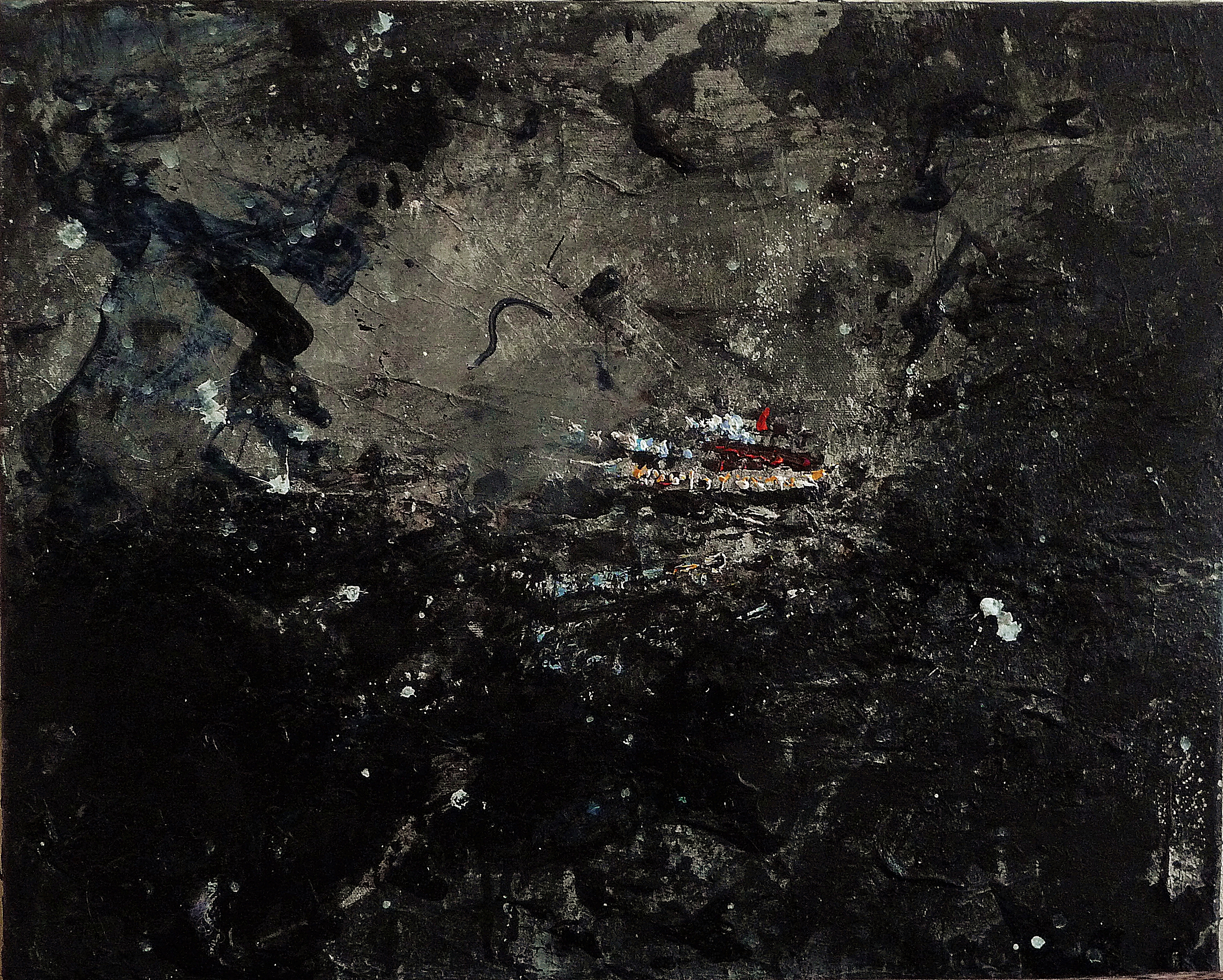
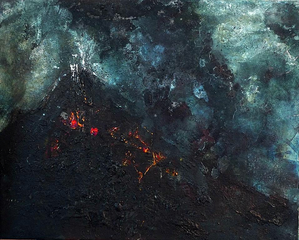
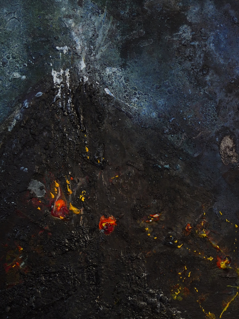
This one minute video is a first exploration by myself and Atzi Muramatsu into a collaboration of line, light and sound…

The finished project (to be presented in July as part of the Nocturn exhibition) will be a longer far more detailed piece with fine lines made in light using an etching plate process, which will then be projected onto the wall. The improvisation between light-lines and sound/cello will be live and this will accompany the exhibition of paintings and (if funding allows!) a piece for string quartet by Atzi

The video above involved an amount of messing around with an overhead projector, fine black pigment and a darkened room. Atzo created the music in response to the video for this first ‘draft’ as it were. It shows the basic idea fairly well, we think, but the finished piece will be more interesting and dynamic – for example patterns in response to sound, and sound in response to lines, which will form a coherenet image or picture by the end. It’s a new approach to our collaboration, which is most enjoyable!


Nocturn – cello and paintings

The video below is the beginning of this year’s collaboration between myself and Atzi Muramatsu (composer and cellist).

We recently talked about the themes of the latest series of paintings (Nocturnes) and Atzi produced a series of works on cello. The mysterious and minimal intro music is a perfect introduction, but I’m particularly moved by the piece that accompanies Nocturn 4, it’s suitably dark in mood, yet there’s an airborn feeling to it, with a sense of searching, or being compelled to explore what we’re not familiar with.

'Nocturn 4'. Mixed media on 20x16" canvas

‘Nocturn 4’. Mixed media on 20×16″ canvas

The tense piece towards the end, and strange primal, dramatic sounds at the end are in contrast to the more lyrical piece that accompanies Nocturn 4, and I felt this was perfect sound accompaniment to Nocturns 3 and 5 which have a sense of more movement, tension and drama.


'Blue 3'. Mixed media on 20x16" canvas

‘Blue 3’. Mixed media on 20×16″ canvas

Nocturn 3 features the suggestion of a ship, or ship’s ferry lights, so I’ve played around with slightly distorted and unsettling effects in the video, which are echoed nicely with the atmospheric creaking sounds Atzi makes with the cello (I think of them as creaky anyway, it might just be me associating with images of boats in trouble at sea!).


Inspiring stuff from Atzi as always. We’re working on a new project to accompany the exhibition in July and I’ll update on that soon.

Blue series day 8


'Nocturnes 5'. Mixed media on 20x16" canvas

‘Nocturnes 5’. Mixed media on 20×16″ canvas

P1300755 P1300756


More experimentation with the volcano inspired painting today, using acrylic, black dylon dye pigment, ground charcoal, salt and varnish. I’ve decided to call this series ‘Nocturnes’ as they’re not strictly speaking blue.

I’m off now for a walk up Edinburgh’s extinct volcano since it’s unusually sunny today

Blue series day 7

Blue 5. Mixed media on 20x16" canvas

Blue 5. Mixed media on 20×16″ canvas

P1300686Today’s painting was part inspired by fireworks at new year, but then developed after seeing a video of the eruption of Sakurajima volcano in Japan.

A few months ago I spent a few weeks filling in funding applications for a creative residency in Japan with composer Atzi Muramatsu. We had no luck though, which is mostly the case for artist’s applications for public funding – the competition is intense at the best of times – particularly at the moment.

Anyway, Atzi sent a video showing a recent eruption on Sakurajima that we’d have seen had we been there. Ah well, I can paint it! The interesting thing is that the composiiton I’d made of fireworks at new year looked so similar to the erupting volcano. This was the original sketch/painting (below)

P1300677I added watery gesso, black pigment and salt then baked it in the oven for half an hour. I’m really enjoying working with black pigment, actually dylon powdered dye for clothes – an excellent idea suggested by my friend Donald when I described the texture I was looking for and depth of black/blue. Here’s a close-up showing the grainy/inky effect..

P1300690


Blue series day 6

'Old Books, Gosford House'. Mixed media on 20x16" canvas

‘Old Books, Gosford House’. Mixed media on 20×16″ canvas

'Blue 3'. Mixed media on 20x16" canvas

‘Blue 3’. Mixed media on 20×16″ canvas

'Blue 4'. Mixed media on 20x16" canvas

‘Blue 4’. Mixed media on 20×16″ canvas

I finally managed to get around to more work on the paintings above today after myriad interruptions and a cold!

I’ve added more detail to Blue 3 after Atzi (the composer I’m collaborating with) commented that the lights reminded him of a ship. I didn’t want it to take too much away from the abstract areas, and hopefully it suggests ship lights without losing spontaneity. Blue 4 has been enhanced simply with colour and I think I’m happy with it now.

Old Books, Gosford House was worked on from photos and sketches taken while visiting the house, which is in Longniddry on the east lothian coast. The house itself is well conserved but I found these abandoned books alongside piles of broken sculptures in a semi ruined building that was probably part of the original stables. It has nothing to do with the more abstract blue/black paintings, but it’s one I’ve been meaning to work on for a few months, and it’s a nice change of colour to work with!

Lindisfarne projects

'Lindisfarne Series No. 1'. Acrylic on 5x5" wood

‘Lindisfarne Series No. 1’. Acrylic on 5×5″ wood

Recently I’ve been talking with the Peregrini Landscape Partnership, which works with the Northumberland Trust to protect and conserve wildlife. I’ll be offering a day’s workshop in painting at some point this year for the Peregrini project, in response to the Isle of Lindisfarne in Northumbria, so let me know if that’s of interest to you.

The workshop will include some practical drawing techniques before we head out into the landscape to paint. It should be fun as I encourage a loose, experimental approach (so-called mistakes aren’t possible, to my mind it’s all part of the process!)

Last year I offered the The Berwickshire and North Northumberland Coast European Marine Site 25% of proceeds from prints of my paintings of Lindisfarne, and you can view or buy mounted prints of those on this link –

Buy Prints for Charities.

The series includes prints of the Isle of Eigg, the Borders and the Bass Rock, with each print donating 25% to a conservation trust related to the landscape painted.

I’m still working on my ‘Blue’ series, but my studio windows are being fixed so I’ve been a bit thwarted as far as painting goes in the past few days!